

There is nothing wrong with a good-looking website. I am very much in favour of them.
I've spent the best part of my working life nudging pixels around until they behave themselves. Moving things three pixels to the left. Moving them back again. Adjusting spacing, kerning, contrast, image crops, button sizes and all the other tiny decisions that nobody notices individually, but everyone feels when they are wrong.
But a website that only looks good will always be half-finished. It might win the first glance, but it still has to survive the second.
That second glance is where the real work begins. Does the visitor understand what the business does? Do they know where to go next? Does the page load quickly? Does it work on a phone? Does it feel trustworthy? Does it sound like the business behind it? Does it help someone make a decision?
Because that's what good web design has to do.
It has to look right, yes. But it also has to work.
Pretty is not the same as useful
A website can be beautiful and yet still be frustrating.
It can have a lovely colour palette, tasteful fonts, elegant photography and a homepage that looks like it belongs in a design awards submission… yet still fail to answer the simplest questions.
- Who are you?
- What do you do?
- Where are you based?
- Why should I trust you?
- What do I do next?
That is often where websites fall down.
Not because they are ugly. Not because the business behind them is bad. But because the site has been treated as a visual object rather than a working system.
A good website is not a poster. It's not just a brochure. It's not a digital business card that sits quietly in the corner, hoping someone knows what to do with it.
A good website should guide people. It should explain, reassure, filter, persuade and make the next step feel obvious.
That applies whether the site is for a tradesperson, a performer, a manufacturer, an ecommerce business, a charity, a theatre production, a luxury jeweller or a local service provider in Doncaster trying to stand out in the cacophony online.
The first glance matters
If we're being honest, the visual side obviously matters.
People make quick judgements online. In the age of short-form video reels, those judgements are often brutally quick. If a site looks neglected, dated, confusing or thrown together, visitors notice. They may not say “this website has poor spacing and inconsistent typography”, but they will feel something is off.
That feeling matters.
Design creates confidence before a single word is read properly. It tells people whether a business feels established, careful, creative, premium, practical, local, specialist, approachable or trustworthy.
That's why visual design still matters enormously. But it is only the start. A polished website gets you through the door. It does not automatically win the room.
The second glance is where trust is built
The second glance is slower.
It's the moment someone starts reading. Clicking. Scanning. Checking. Comparing. Looking for signs that this business is the right fit.
That is where real work, clear services and client testimonials start to matter. They help turn a first impression into something more credible.
That's where structure becomes important.
A visitor should not have to work hard to understand a business. They should not have to dig through vague copy, hidden contact details, broken layouts or pages that say a lot without really saying anything.
Good web design gives the visitor enough information to feel oriented.
That means clear headings. Useful content. Sensible navigation. Strong calls to action. Well-chosen images. Fast pages. Mobile-friendly layouts. Search-friendly structure. And, perhaps most importantly, a tone of voice that sounds like an actual business run by actual people.
- Not AI slop.
- Not filler.
- Not jargon.
- Not “we are passionate about delivering solutions” repeated until the will to live quietly leaves the room.
Some of us still have Internet Explorer trauma
This is where the old web designer in me starts muttering into his coffee.
For anyone who started building websites pre-mobile era, web design was never just “making things look nice”. Sometimes it was a battle just to make things look vaguely the same in different browsers.
There was a time when you could build something beautifully, check it in Firefox, breathe a sigh of relief, then open it in Internet Explorer and watch the whole layout fold in on itself like a deckchair in a gale.
IE5 and IE6 in particular were responsible for a lot of lost afternoons, late nights and deeply unprintable language.
Firefox, Opera and Safari would often just… work.
Internet Explorer would look at your carefully built layout, shrug, and decide that padding, margins, transparency, floats or basic standards were more of a loose suggestion than an agreement.
Those years taught web designers a useful lesson: appearance is fragile unless the foundations are right.
A website is not just what you see on the surface. It is the code underneath, the browser support, the structure, the content, the performance, the accessibility, the hosting, the optimisation and all the little technical decisions that decide whether the thing works properly in the real world.
The tools have changed, thankfully. The principle has not.
A website has to feel like the business
This is one of the things I come back to again and again.
A good website should not feel like a template with a logo dropped into the corner.
It should feel like the business.
That does not mean every site has to be wildly experimental. Sometimes the right answer is calm, clean and direct. Sometimes it is bold and theatrical. Sometimes it needs to feel high-end. Sometimes it needs to be practical and straight to the point.
The job, and this is where I feel DESIGN DPI excels, is to understand what the business needs to communicate, then build around that.
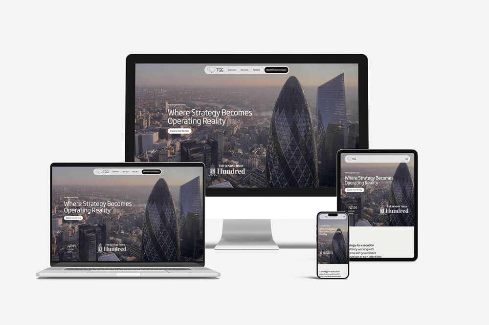
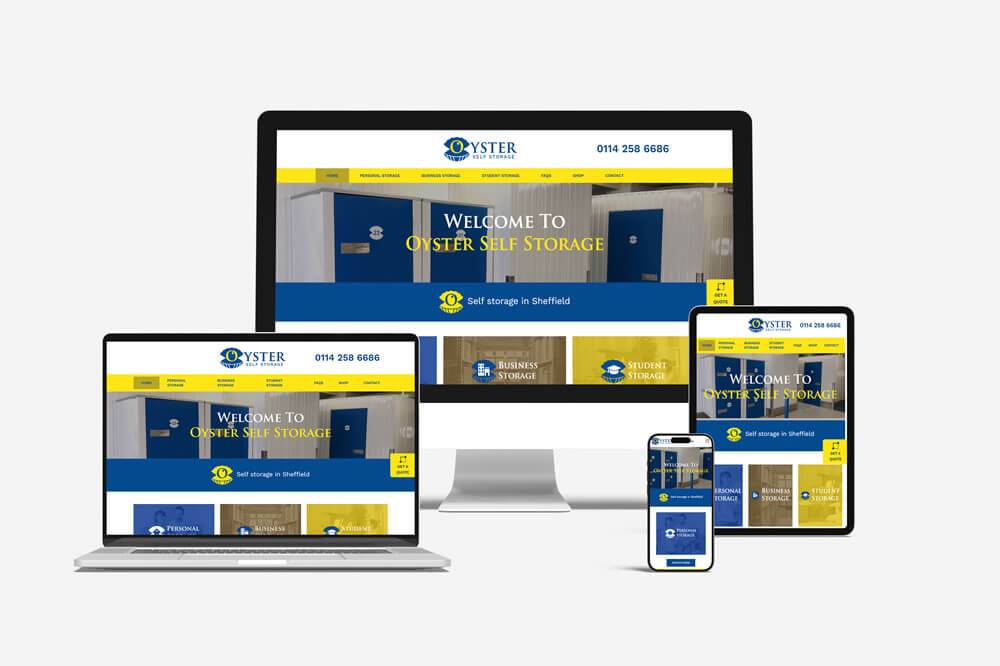
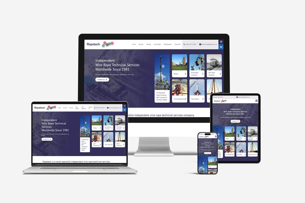
A website for a performance act should not feel the same as a website for a compliance company. A site for a musical should not feel the same as a site for a local service business. A luxury jewellery site should not feel the same as a brochure site for a trade supplier.
It may seem obvious, but that's the point.
Different businesses need different online experiences.
Different websites. Different jobs.
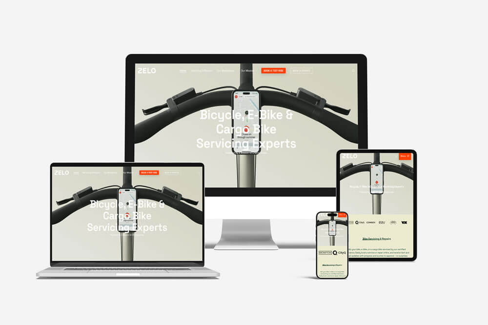
This is where web design becomes more interesting than decoration, and it is something you can see across the DESIGN DPI portfolio.
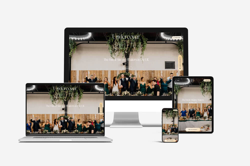
Take a project like Undercover Artists. That kind of website has to carry a sense of performance. It needs style, movement, confidence and atmosphere. But it also has to work for the person planning an event, checking credibility, watching clips, reading about the act and deciding whether to make an enquiry.
It cannot just look theatrical. It has to help someone take the next step.
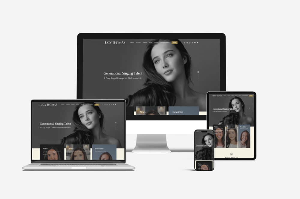
Or Lucy Thomas Music, where the website needed to support an artist, a release, an audience and an ecommerce journey. The design needs to feel elegant and polished, but it also has to keep the user moving. Listen, look, learn, buy, follow, connect.
Again, not just pretty. Purposeful.
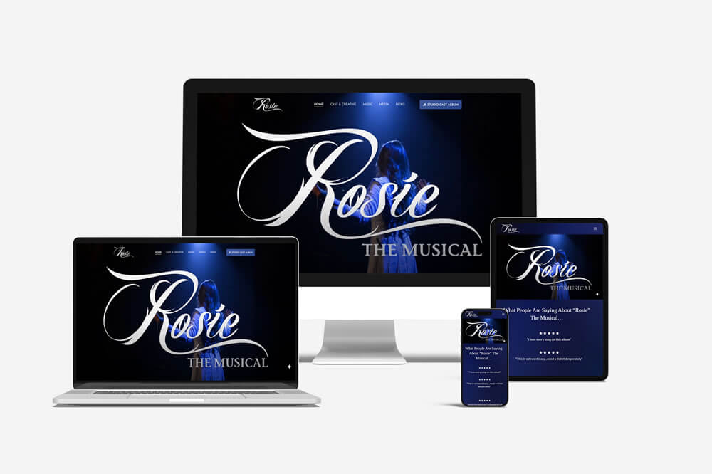
Then there are projects like Rosie the Musical, where the website has a different kind of job. It has to carry story, cast, tone, production value, performance information and public interest. It needs to feel alive. A musical website is not just an online flyer. It has to create enough curiosity for someone to want more.
That creative thread has grown across several music and performance projects over the years, something I explore in more detail in What Music Websites Taught Me About Designing for an Audience.
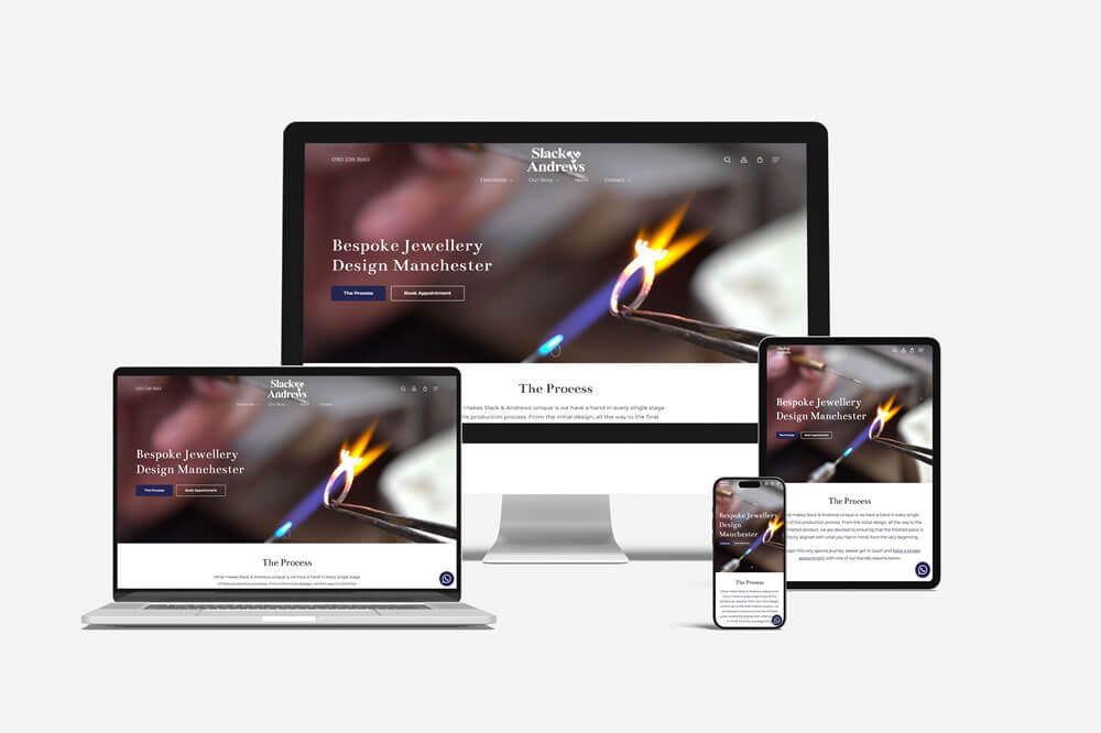
And then something like Slack & Andrews sits in another space again. High-end. Considered. Carefully presented.
An expensive marquise-cut diamond on-screen never hurts, obviously. But even then, the website cannot rely on the sparkle alone. The surrounding experience has to feel right. The layout, photography, typography, pacing and wording all have to support the sense of quality. When the product is premium, the website cannot feel casual, cluttered or careless.
The more valuable the thing being shown, the more important the restraint around it becomes.
Good design removes friction
A lot of web design is really about removing tiny moments of doubt.
- Is this business still active?
- Are they local?
- Do they understand what I need?
- Can I trust them?
- Where is the thing I came here for?
- Why is this page taking so long to load?
- Why is the menu doing that?
- Where is the phone number?
- Why does this form feel like applying for a mortgage?
Every awkward moment adds friction.
Sometimes that friction is visual. Sometimes it is technical. Sometimes it is in the wording. Sometimes it is in the structure. Sometimes it is because the site was built around what the business wanted to say, rather than what the visitor needed to understand.
Good design reduces that friction.
It makes the journey feel obvious without making the website feel basic. It gives people enough information without overwhelming them. It makes the business look credible without turning the page into a self-congratulatory wall of text.
There is a balance, and that balance is where a lot of the real design work lives.
The boring stuff matters too
Nobody gets excited about image compression at a first meeting, which is fair enough. But people do notice when a website is slow.
They notice when images jump around. They notice when pages feel clumsy on mobile. They notice when text is hard to read. They notice when buttons and touch points are too small, forms are awkward, pages are confusing or the site feels like it has not been touched since 2014.
Search engines notice a lot of that too.
A modern website needs good foundations. That includes performance, mobile responsiveness, search engine structure, clean code, security, accessibility considerations, image optimisation and sensible content hierarchy.
Not because these things sound impressive in a proposal.
Because they affect whether the website does its job.
A business website should not just look finished. It should behave finished.
Local websites need more than local keywords
Because this is a Doncaster web design article, we should probably talk about Doncaster web design.
There. Done.
The phrase has been said.
The trick with local SEO is not to cram “Doncaster web design” into every other sentence until the page reads like it has been assembled by a malfunctioning printer.
Local relevance matters, but it has to feel natural.
A website should show where a business fits, who it serves and why that matters. For local businesses, that might mean clear service areas, local examples, proper contact details, location cues, relevant case studies and content that sounds like it has been written by someone who actually knows the area.
Search visibility matters. Of course it does. But the content still has to be useful when a real human lands on it.
Because ranking is only part of the job.
Being chosen is the other part.
A good website earns its keep
This is the bit that often gets overlooked.
A website should continue doing useful work after launch.
It should support enquiries. Answer common questions. Build confidence. Help people compare. Showcase work. Explain services. Sell products. Promote events. Strengthen a brand. Reduce admin. Improve visibility. Give the business something solid to point people towards.
A website is not finished because it is live. It is finished when it is doing what it was built to do, and even then, it should keep evolving.
Businesses change. Services change. Audiences change. Search behaviour changes. Technology changes. Design expectations change. Sometimes the website needs a full rebuild. Sometimes it just needs sharper content, better structure, cleaner calls to action or a few sensible improvements behind the scenes.
The best websites are not frozen in time. They are maintained, reviewed and improved.
Looking good is the start, not the strategy
So yes, your website should look good. It should look very good.
It should feel considered, professional and appropriate for the business behind it. The colours, fonts, images, spacing and layout all matter.
But that is not the whole job.
A website also needs to explain clearly, load quickly, work properly, guide visitors, support search, build trust and make the next step easy.
That is what separates a website that simply looks nice from one that actually works.
And in the end, that is the difference that matters.
Because the first glance might get someone interested.
But the second glance decides whether they stay.
Need a website that does more than sit there looking pretty?
DESIGN DPI creates considered, practical and visually distinctive websites for businesses, performers, organisations and creative projects in Doncaster and beyond.
From clean brochure websites to ecommerce, portfolio sites and more complex digital projects, the aim is always the same: build something that looks right, works properly and gives people a reason to act.
If your current website looks the part but needs to work harder, you can book a call or request a quote and start the conversation.

If you’d like to speak to us about how our multi-award-winning web design can guide your company through its digital journey, get in touch today, call 01302 513 515, email [email protected] or complete the form on the contact page.