

A music website is rarely just a website
It's part stage, part poster, part press kit, part archive and part shop window. It might need to sell an album, promote a performance, secure a booking, introduce an artist to somebody for the first time, or simply make an existing fan feel they have arrived in exactly the right place.
Before a note has been heard, before a ticket has been booked, before anybody presses play, the website has already begun telling the audience what to expect.
That is what has always made music websites particularly enjoyable to design.
They're rarely anonymous. They're rarely beige. They tend to arrive with personality, ambition and a very clear idea of how they want people to feel.
And, looking back, I appear to have designed rather a lot of them.
It Started With a Wedding Band and a Few GIF Buttons
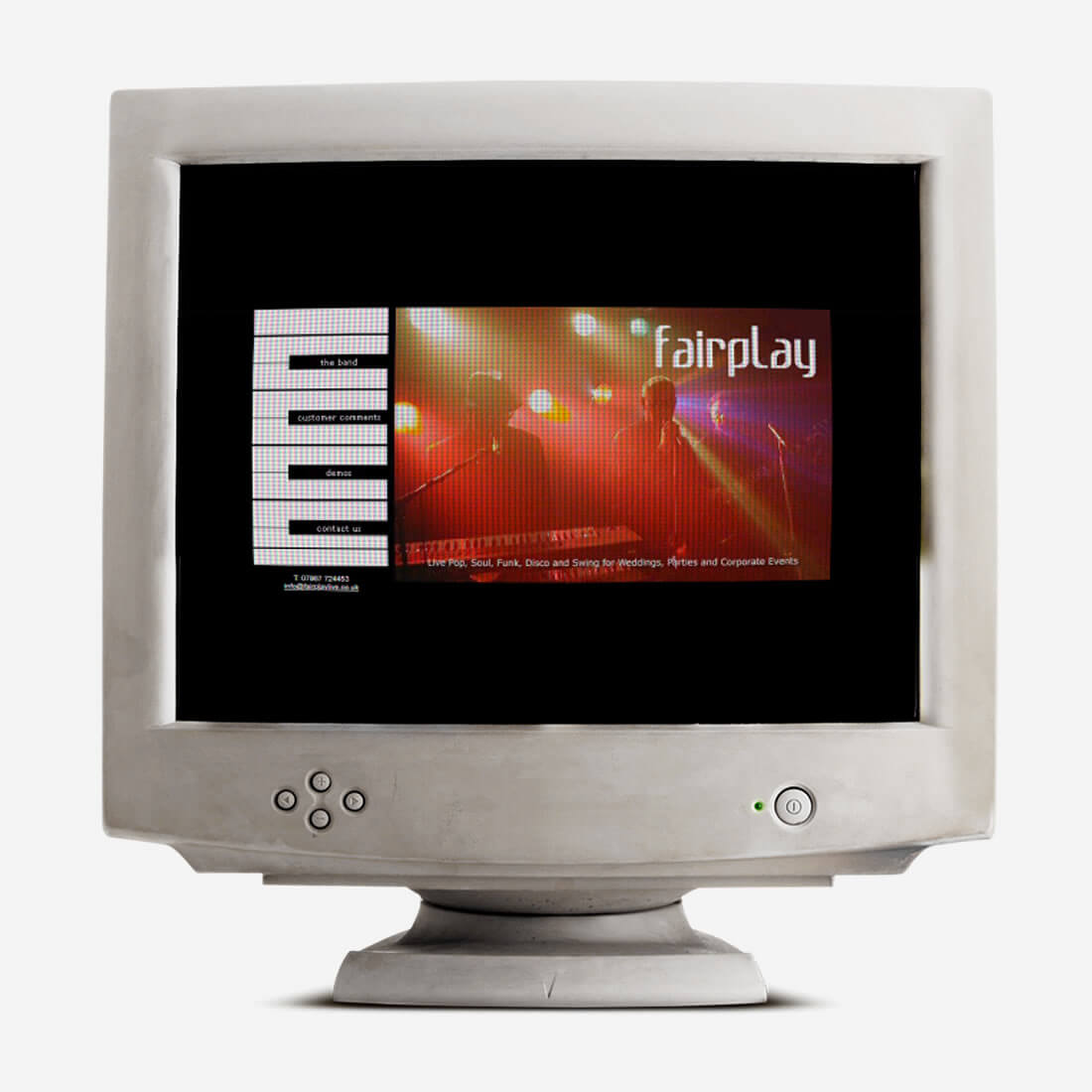
Long before DESIGN DPI was formally established, and not too long after I created my first commercial website in 1997, I worked on a website for a wedding band called Fairplay Live.
For years, I thought almost all trace of that site had disappeared.
The only files I had managed to recover from an old backup were three tiny GIF images: 00.gif, 01.gif and 01a.gif. Essentially, two buttons and a mouseover state. Not exactly enough to reconstruct a glittering portfolio case study.
Then, rather wonderfully, I found the original site on the Internet Archive.
And there it was.
A full website from the late 1990s, complete with a menu designed around piano keys: the band, the members, tunes, contact us. At the time, it felt clever, contemporary and entirely appropriate for a live band website.
Looking at it now, it is very obviously from another era of the web. But I have to admit, it still made me smile. For something created around 1998, it looked pretty good.
It was built in a world before WordPress, before page builders, before responsive design, before anybody had to consider whether a website worked properly on a phone held in portrait orientation while somebody walked through a supermarket.
There were GIF buttons. There were rollover states. There was a certain amount of trial and error. There was also the excitement of building something visual, functional and genuinely online.
That same feeling recently came flooding back when I recovered my very first commercial website design for Clinical Data Technologies. The two sit very neatly together: early evidence that, even back then, I was not simply interested in getting content onto a screen. I wanted it to have character.
One Wednesday Evening on Twitter Changed Everything
Fast forward to 2012.
Every Wednesday evening, Twitter used to come alive with a Yorkshire business networking hour called #YorkshireHour. It was fast, noisy, occasionally chaotic and, as it turned out, surprisingly useful.
One evening, I received a direct message from a classical-crossover soprano called Rebecca Newman.
She already had a website, but was considering an upgrade. Her message explained that she had been reluctant to appoint a designer because many appeared to lack creativity and style. She wanted something that retained the structure of her existing DIY site, but felt far more polished and included features such as an integrated music player.
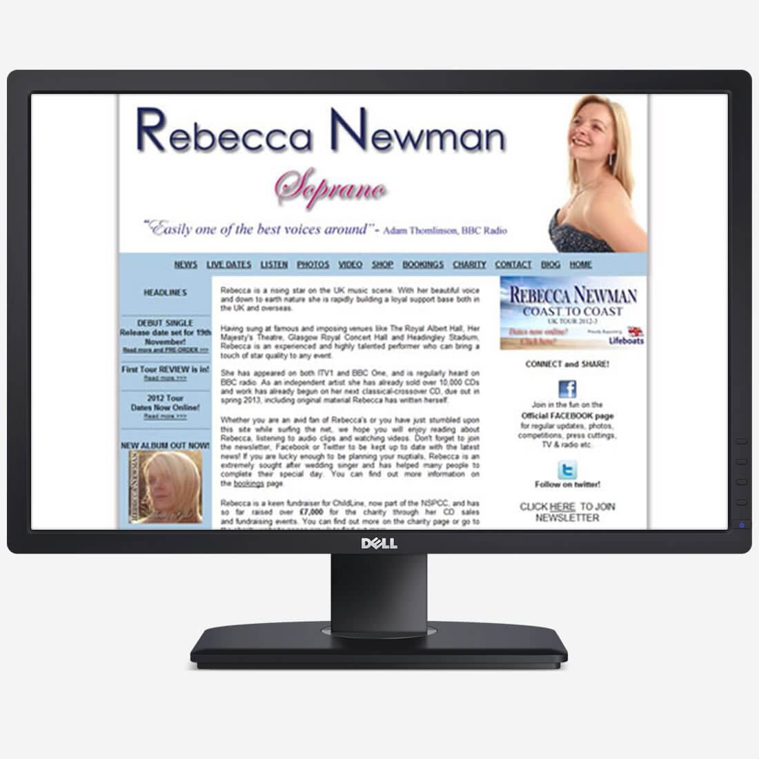
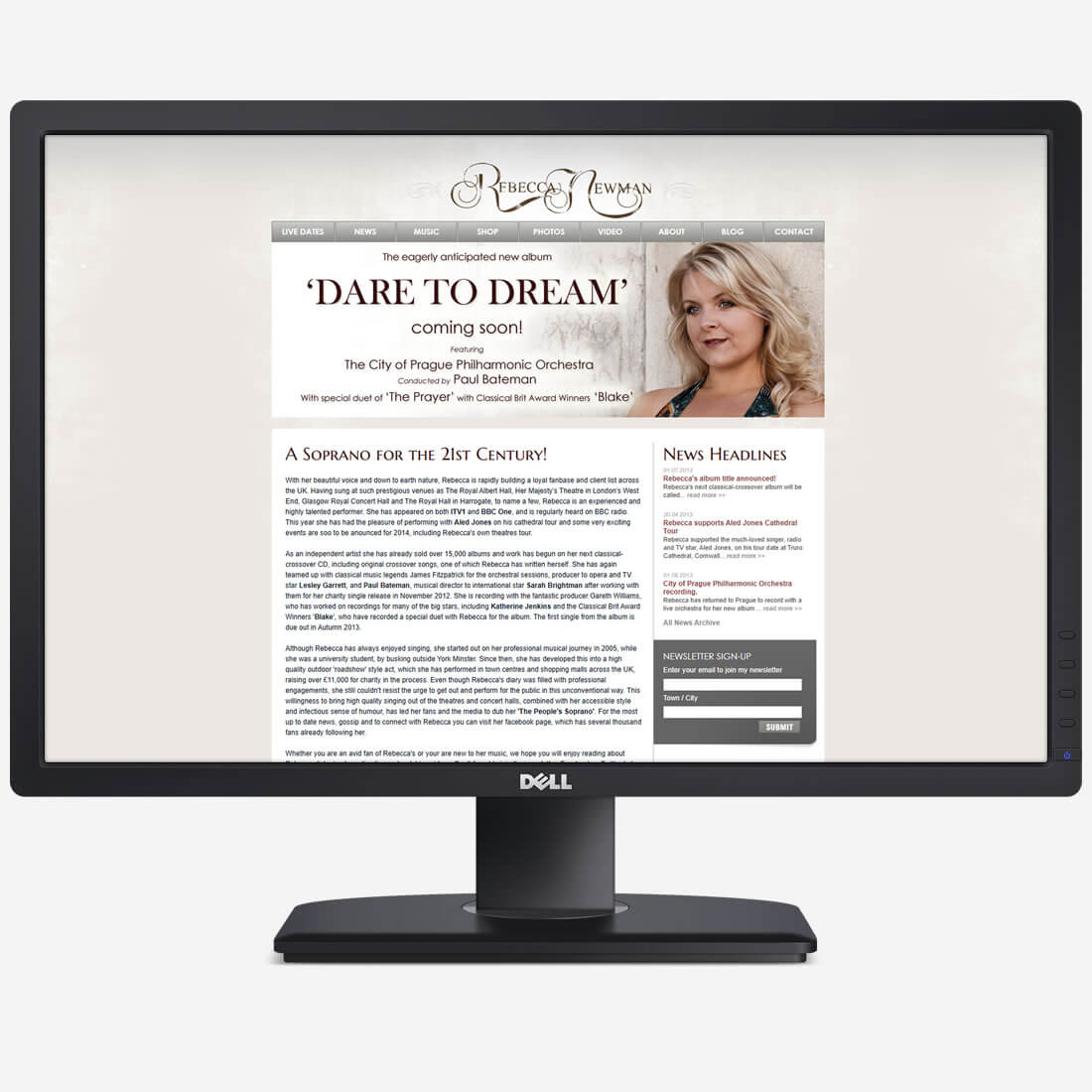
That single conversation led to the launch of Rebecca’s new website in November 2012, and to a working relationship which involved concept designs, careful revisions, music, photography and attending one of her album launch events in York.
Rebecca was meticulous about the presentation of her work. Quite rightly so. Her website was representing her before somebody had heard her perform, bought a CD or attended a concert.
What I remember most clearly about that project, though, is the confidence it gave me.
The site was developed primarily using Joomla because that was the platform Rebecca was familiar with. I was not. At least, not when the project began.
But that is part of being a web designer and developer. You work things out. You research. You test. You occasionally disappear down a technical rabbit hole and emerge several cups of coffee later with something that works exactly as it should.
Rebecca’s site was considerably more ambitious than the website she previously had, and considerably more demanding than many projects I had worked on at that point.
It also taught me that I was a better developer than I had perhaps given myself credit for.
Most importantly, it became the beginning of a thread.
A single Twitter conversation, on an ordinary Wednesday evening, introduced DESIGN DPI to a whole world of performers, singers, artists and creative businesses.
The original 2012 DESIGN DPI post still records the launch of Rebecca Newman’s redesigned site, the #YorkshireHour introduction and the importance placed on audience feedback throughout the build.
The Referral Trail Begins
The launch of Rebecca Newman’s website led, directly or indirectly, to several other music-related projects.
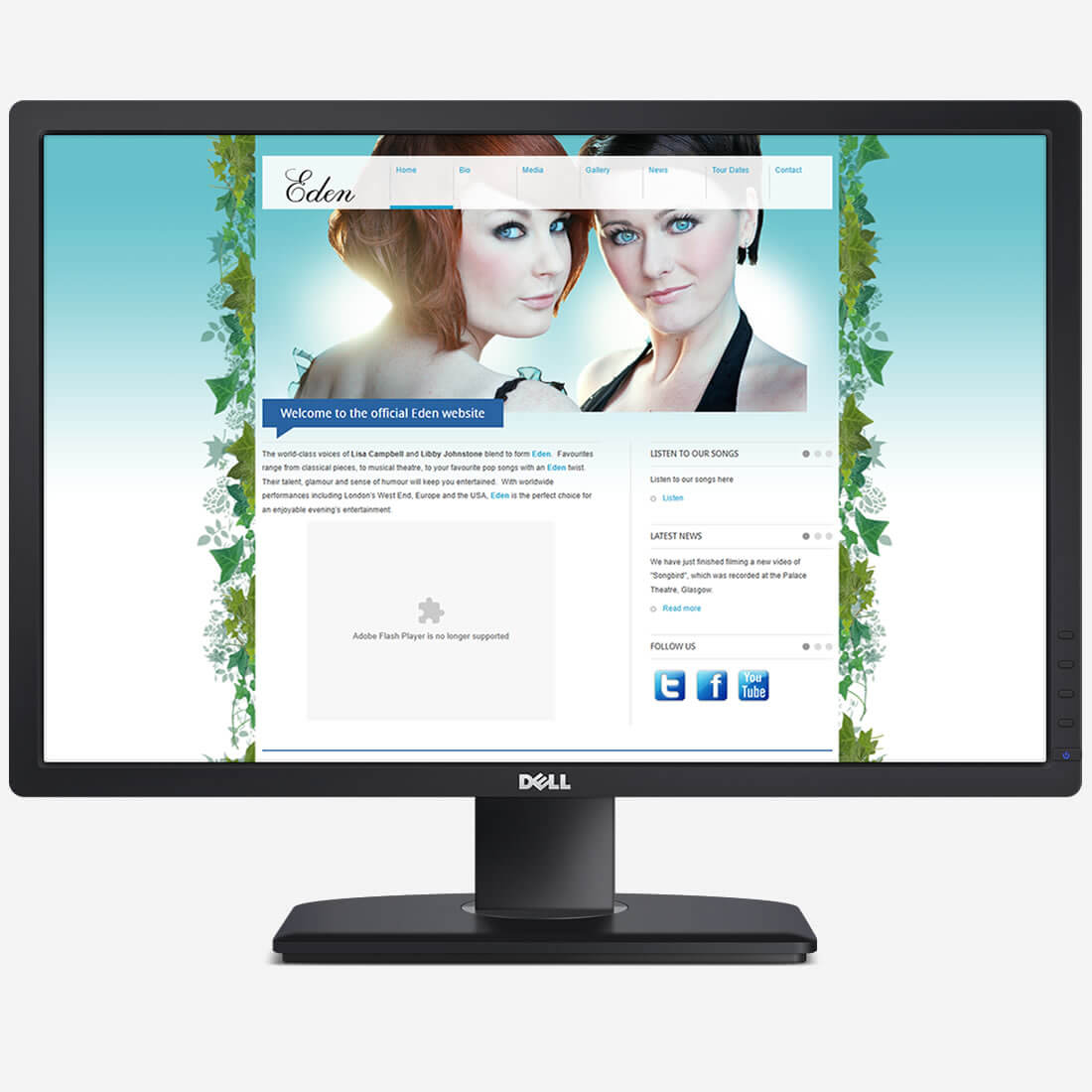
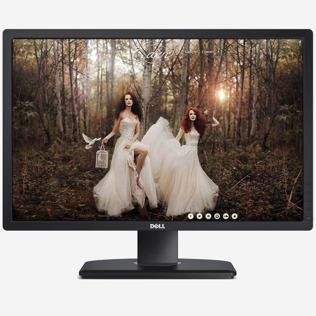
One of the first was Eden, a classical crossover duo whose existing website had been online since at least 2010. By the time I became involved in around 2014, the brief required much more than a cosmetic redesign. The finished site combined a carefully art-directed visual style with more complex functionality behind the scenes.
It was the kind of project that stretches you.
The client knows what they want the finished result to feel like. They have imagery, personality and expectations. What they do not necessarily know, nor should they need to know, is how difficult some of those ideas might be to build.
That is where the job becomes interesting.
Somewhere around that time, my young daughter wandered into the office while I was working on an update and saw photographs of Eden on screen.
She looked at them, looked at me, and asked:
"Do you work for princesses?”
It remains one of the better summaries of a client project I have ever received.
The website may now show its age, particularly on mobile, but it represents a very important period in my own development. It was another point where I realised that bespoke design and bespoke functionality did not need to be intimidating. They were simply problems to solve carefully.
And occasionally they made you look as though you worked for princesses.
When the Website Becomes Part of the Performance
From Eden came another introduction: Undercover Artists.
Their business is based around surprise performers and singing waiters, creating those wonderfully chaotic moments where an apparently ordinary member of staff suddenly launches into song and an entire wedding breakfast or corporate event changes gear completely.
The original website launched around 2016. It was one of those projects where the photography immediately told you what the design needed to be: elegant, theatrical, confident and full of movement.
At the time, parallax scrolling and animated content transitions still felt fresh. Used carefully, they gave the site a sense of reveal and performance without getting in the way of the information visitors actually needed.
The result was a website that felt like the act.
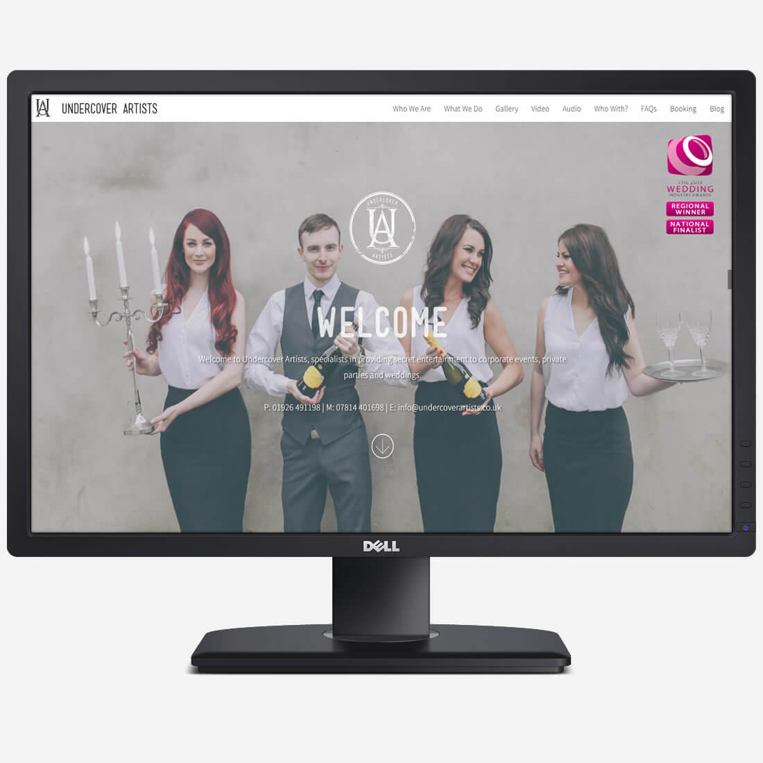
That, to me, is the key difference with a really successful music or performance website. It cannot simply say, “here is a singer” or “here is an entertainment company”. It needs to convey the atmosphere of what booking that performer might actually feel like.
Undercover Artists went on to become a particularly satisfying project, not least because the client began hearing exactly what any designer wants to hear:
“Oh, you’re the company with the amazing website.”
Several years later, in 2024, we returned to the project and rebuilt the website in WordPress, giving an established and successful entertainment company a more flexible, modern platform for the next stage of its growth.
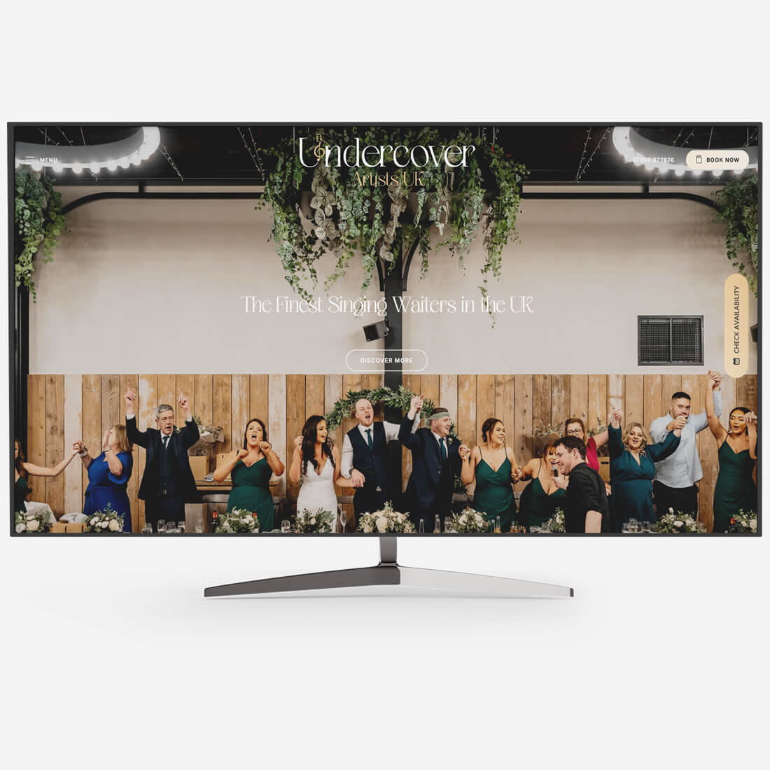
Today, more than a decade after the business was established, Undercover Artists performs at more than 300 weddings and events each year.
Creative People Tend to Find Creative People
That is another curious thing about these projects.
Good creative work has a habit of travelling.
The Undercover Artists website led to further work, including The Dukes, a male vocal group requiring a stylish, stripped-back one-page website with something of a modern Rat Pack feel. The brief was essentially: clean, simple and suitably sophisticated… “like an advert for GQ magazine”.
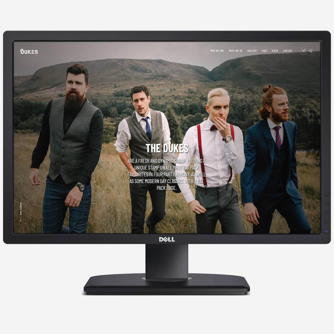
That is the kind of brief I enjoy. Clear enough to establish a direction, open enough to leave room for design.
The same referral thread also reached beyond music.
Artist Jess Ridley approached DESIGN DPI after seeing a friend’s website that she loved. Jess is a wonderfully talented artist, but also an impressive vocalist in her own right, which makes her feel like another unexpected branch of this same creative family tree.
Her website then opened the door to further creative referrals of its own.
One website does not always lead neatly to another in a way you can measure on a spreadsheet. Sometimes it simply places your work in front of people who appreciate detail, individuality and the fact that a website can feel designed rather than assembled.
That has been one of the most rewarding parts of working with performers and artists over the years.
Some Briefs Make You Earn Your Lunch
Not every music website begins with an elegant photograph and a beautifully obvious design route.
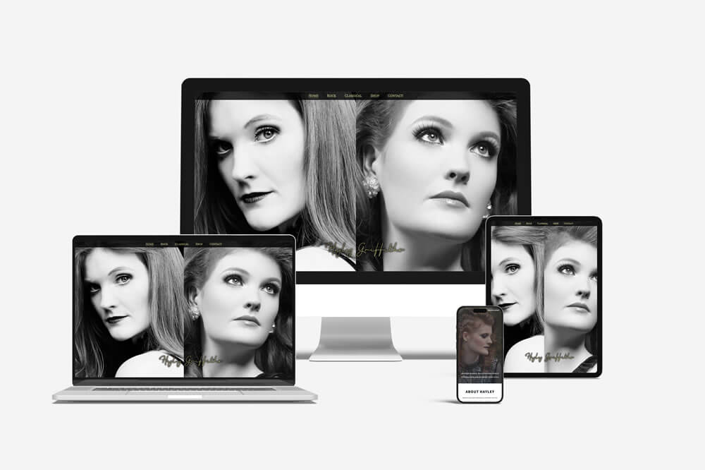
When Hayley Griffiths approached DESIGN DPI, her existing website had effectively stopped functioning. More importantly, she presented a particularly challenging creative brief.
Hayley performs both as a classical soprano and as a rock singer. She wanted a homepage that represented both sides of her musical identity through a literal split-screen design.
Now, looking back, the solution may seem straightforward enough.
At the time, it most certainly was not.
There were multiple versions, numerous tests and more than a few sessions spent investigating whether the design I had confidently suggested was, in fact, technically sensible.
Eventually, it worked.
The resulting desktop website gave visitors two distinct routes into Hayley’s world: classical and rock, elegant and dramatic, two sides of the same performer presented on one screen.
On mobile, that same solution was not appropriate, so a separate, scaled-back version was created specifically for smaller screens. It was one of the last occasions where I built effectively separate desktop and mobile experiences, before responsive and mobile-first workflows became the default approach they are today.
But the lesson stayed with me.
Sometimes the most interesting design ideas are the ones that initially make you wonder whether you have bitten off more than you can comfortably chew.
Those are often the projects that teach you the most.
The current DESIGN DPI portfolio page still documents Hayley’s requirement for a split-screen design representing both her rock and classical soprano work, along with her testimonial that the finished site captured the brief “and more”.
From a Debut Album to More Than One Million Subscribers
In 2019, another music website arrived through the same growing network of referrals.
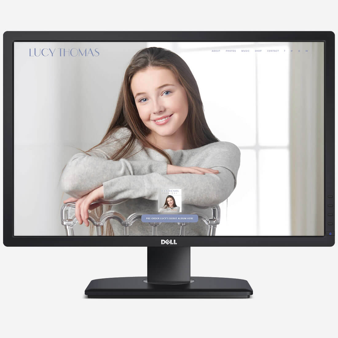
Lucy Thomas had recently appeared on The Voice Kids and was preparing to release her debut album, Premiere. The original website was designed as an elegant one-page platform: simple, carefully styled and focused around the album launch.
At that stage, the website needed to introduce a young singer, support the release of her first album and make it easy for visitors to listen, learn more and buy.
As Lucy’s career developed, so did the work.
Further albums required new artwork, adjusted colour palettes, refreshed website content and promotional material. There have been album covers, full booklet artwork, dozens of single covers, social media graphics, flyers, banners, merchandise designs and audio editing for track previews.
The original static website was eventually redesigned and rebuilt in WordPress in January 2025, giving a far larger catalogue of music, video, events, shop content and press information a more suitable home.
And somewhere along the way, the young singer whose first website accompanied a debut album grew an audience of more than one million YouTube subscribers.
That feels significant.
Not because a website can take credit for somebody’s talent or success, it absolutely cannot. But because there is something enormously satisfying about being trusted to help present that journey properly as it unfolds.
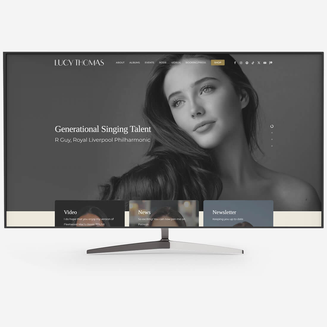
Today, Lucy’s website has grown into a fuller WordPress home for albums, video, events, shop content and press information, reflecting an audience now measured in seven figures on YouTube. The original website was created following her appearance on The Voice Kids and to support the release of Premiere.
When a Website Needs to Feel Ready for the West End
That relationship eventually led to another particularly memorable project: Rosie The Musical.
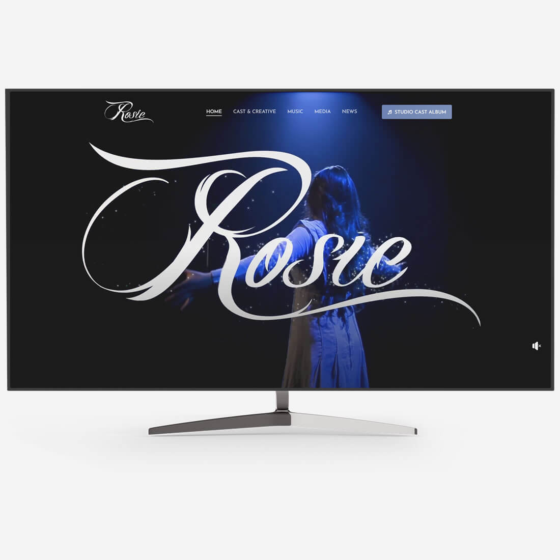
The website needed to feel theatrical from the outset. Not theatrical in the sense of adding a velvet curtain graphic and calling it a day, but properly confident, elegant and capable of sitting alongside established musical theatre productions.
The brief was driven by an ambitious new musical, an original studio cast recording and a story intended for a much bigger stage.
The finished website brought together the musical’s story, cast and creative team, music, press material, news, video and opportunities for visitors to follow the production’s progress.
It also gave me an opportunity to explore poster concepts and promotional imagery, including some early experiments using AI-generated source artwork before adding the typography, identity, composition and production detailing required to turn an image into something approaching a real campaign concept.
That particular strand probably deserves a post of its own.
Because by this point, the work was no longer just about designing a homepage for a singer or a band.
It was about creating a digital home for a theatrical world, showcasing the original studio cast album, news, music, video and, in March 2026, a one-night semi-staged West End gala performance at the Adelphi Theatre.
The Tools Change. The Audience Does Not.
Across these projects, the tools have changed enormously.
There were early GIF buttons and rollover states. There was Macromedia Dreamweaver, which I used from somewhere around version 3 in the late 1990s until well into the modern web era. There were static HTML websites, Joomla builds, custom PHP elements, separate mobile versions, WordPress rebuilds, ecommerce features and increasingly complex promotional requirements.
Eventually, Dreamweaver became far less important to how I worked. Notepad++ increasingly took its place, because once you know your way around the code, sometimes the best tool is simply the one that lets you get on with it.
But the central question has remained surprisingly consistent:
What should the audience feel when they arrive?
For a performer, a musician or a theatrical production, that question matters immediately.
The visitor needs to understand the tone before they understand the detail. They need to feel whether this is elegant, intimate, dramatic, contemporary, joyful, premium or capable of transforming a room full of unsuspecting wedding guests into a singalong audience.
That is why these projects have always been so enjoyable.
Musicians and performers tend to understand instinctively that presentation matters. Their photograph matters. Their name matters. Their album artwork matters. Their stage presence matters. Their website is simply another part of that same performance.
Designing for People Who Already Understand Audiences
Not every performer or emerging creative project begins with the marketing budget of a national brand, a record label or a major theatre production.
But many arrive with something just as important: conviction.
They know the audience they want to reach. They know the atmosphere they want to create. They understand that somebody seeing their work for the first time is making a decision almost immediately.
That makes for rewarding design work.
It also explains why one music website has so often led to another. Creative people notice when something feels right. They recognise care, originality and attention to detail. When their friends, colleagues or fellow performers need somebody to help present their work properly, those recommendations mean a great deal.
From a wedding band website built in the late 1990s, to a soprano discovered during an evening on Twitter, to singing waiters, classical performers, album releases, merchandise artwork and a musical reaching the West End stage, it has been quite a journey.
And perhaps that is what music websites taught me most of all.
A website should never just exist.
It should understand who it is speaking to.
It should know when to be quiet, when to be confident and when to raise the curtain.

If you’d like to speak to us about how our multi-award-winning web design can guide your company through its digital journey, get in touch today, call 01302 513 515, email [email protected] or complete the form on the contact page.