Logos are everywhere…
At their best, they become the visual link between a business and the people it is trying to reach. Long before someone reads a paragraph of copy, clicks a button or picks up the phone, a logo is already doing its job. It starts to build recognition. Familiarity. Trust. Sometimes even emotion.
That is why getting a logo right matters.
A good logo is not just something that “looks nice”. It needs to be distinctive, memorable and appropriate. It needs to work across different sizes, formats and environments. It has to sit comfortably on everything from websites and social icons to business cards, letterheads, signage and merchandise. Above all, it needs to feel like it belongs to the business it represents.
That is exactly the thinking behind the current DESIGN DPI brand mark.
Not arbitrary. Considered.
The logos I tend to admire most are the ones that feel considered rather than arbitrary.
Even when they appear simple, there is usually a structure beneath the surface. A system. A rationale. An understanding of proportion, spacing and visual balance. That does not mean the design process is cold or purely mathematical, but it does mean the final result has been shaped with intent.
That is true here.
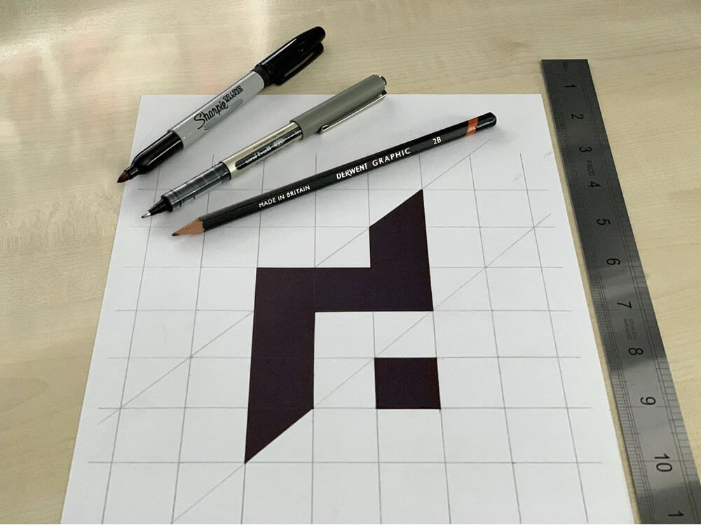
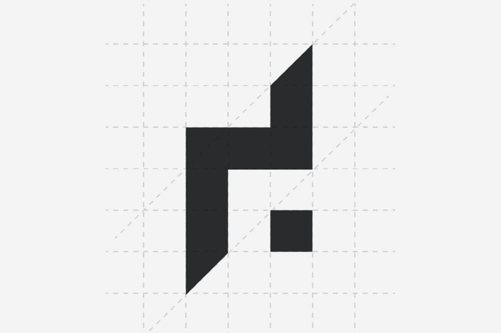
The DESIGN DPI brand mark is not a random symbol or decorative motif. It is a constructed geometric letterform built around an implied lowercase d, using negative space, proportion and a modular grid.
It is, depending on how you look at it:
- a geometric letterform
- a monogram-style brand mark
- and a constructed abstract symbol
Because although it is stylised and reduced, it is clearly rooted in the letter d.
Not a generic typographic d lifted from a font, but something custom-built. Something distilled.
“d”, the dot and the discipline behind it
The first thing most people see is the d, and that immediate legibility matters.
But the more time you spend with it, the more the other layers begin to reveal themselves. The detached square is a literal nod to the dot in DPI. The spacing, diagonals and proportions introduce a sense of structure, measurement and construction. The diagonal cuts bring motion and direction. The mark feels stable, but not static.
It has a nice balance of stability and motion.
- The vertical stem gives it authority.
- The horizontal bar gives it structure.
- The diagonals give it lift and forward motion.
- The detached square gives it punctuation and identity.
That little square does a lot of heavy lifting. Without it, the mark would still function. With it, it becomes much more distinctive and conceptually complete.
There is also something pleasing to me about the fact that the mark has an immediate read, but then rewards a second look. That is often the sweet spot in logo design. You want clarity first, depth second.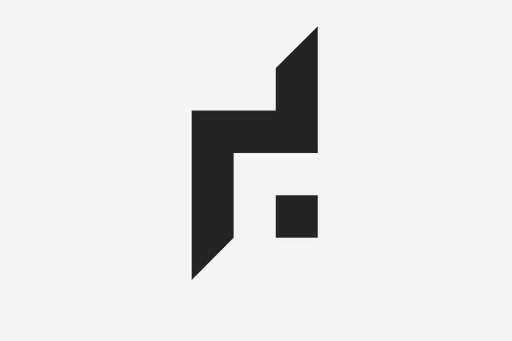
Negative space, used intentionally
One of the more important technical aspects of the mark is the role of negative space.
Strictly speaking, I would not describe it as only a negative space logo, because the positive forms are doing just as much work. A more accurate description would be a geometric letterform with negative space playing a key role in defining the form.
That feels closer to the truth.
The d is not explicitly drawn in the usual typographic sense. It is implied through shape, structure and absence. The eye completes it. That relationship between positive and negative form is part of what gives the mark its character.
And when negative space is used well, it tends to do exactly that. It creates harmony. It gives a logo subtlety. It invites the viewer in just a little. It can make a symbol feel more intelligent, more elegant and more resolved.
Here, that use of negative space is entirely intentional.
Geometry, craft and a measured approach
There is a definite geometric logic behind the mark.
The grid matters. The spacing matters. The alignment matters. The proportions matter. The diagonals are not there by accident, and neither is the modular rhythm within the composition.
That kind of construction is something I have always enjoyed in design. Not as an exercise in being overly rigid, but because understanding the underlying system often helps a logo feel more balanced, more harmonious and more enduring.
Of course, there is always a danger that a purely mathematical approach can become too cold or too rational. Good design is rarely just numbers and lines on a grid. There has to be judgement in it too. Instinct. A feel for form.
That balance matters.
For me, the strongest logos usually sit somewhere between discipline and intuition. You can absolutely use geometry, proportion and repeatable structure to build a mark, but you still need an eye for when something feels right.
Modernist, but not cold
The DESIGN DPI brand mark definitely leans into a modernist aesthetic.
There are hints of Swiss design thinking in the clarity, restraint and grid-led construction. There is a touch of Bauhaus in the way the form is reduced to essentials. Even a faint nod to movements such as cubism or futurism in the use of bold geometry and directional energy.
That all sounds very lofty, but visually the point is quite simple: the mark is made from primitive shapes, yet it still feels elegant.
That is part of why I like it.
It feels modernist, but not cold. Structured, but not stiff. Clean, but not anonymous. The angular cuts stop it becoming too static or too polite. They introduce a little tension, a little movement, a little forward momentum.
That sense of direction feels right for DESIGN DPI.
Drafting, construction and old-school process
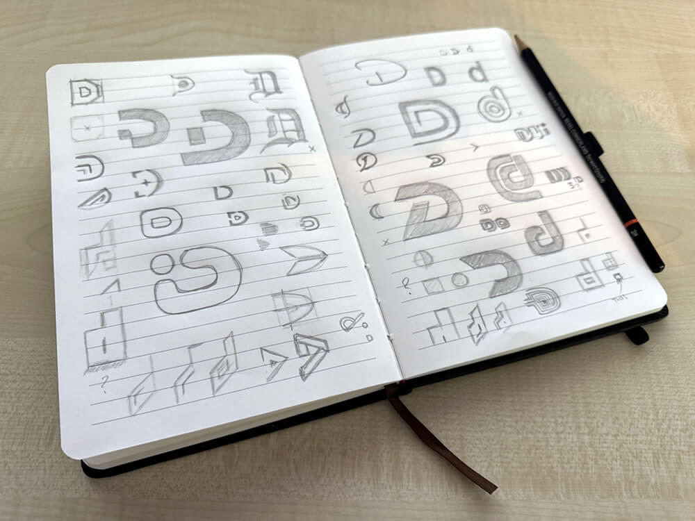
One of the things I enjoy most about this logo is that it did not begin and end on a screen.
There is something about sketching ideas by hand that feels more natural. More instinctive. Less constrained than sitting straight down at Illustrator and trying to force a solution too quickly. Pen and paper have a way of letting ideas breathe. You can explore form more freely. You can respond to shapes faster. You can think through composition in a more tactile way.
That was very much part of this process.
The current brand mark was developed with a real sense of construction behind it. Grid. Ruler. Pencil. Angles. Drafting. That was not just for show. It was part of reconnecting with a more foundational way of making.
And on a personal level, that means something.
The logo is, in part, a nod to my Grandad, who was a draughtsman for BP. It is also a nod to school CDT lessons in the 1990s, pencil and geometry tools in hand, which I genuinely loved. There was always something deeply satisfying about drawing, measuring, aligning and building an idea from first principles.
So while the mark is digital in its final form, the thinking behind it comes from somewhere much more tactile.
A more mature identity
Like most long-standing businesses, DESIGN DPI has not had just one logo.
The identity has evolved over time, reflecting different stages of life, work and personality. The earlier versions each had their place. The 2018 iteration in particular was intentionally more playful, more colourful and more informal. At that time, that felt right. It reflected a lighter, more family-centred energy. Mia was young, and I quite liked the idea that while Dad might be in the office a lot, the brand did not always need to take itself too seriously. A pink paint splat can say quite a lot.
But by 2022, it felt like the right moment to return to something more stripped back and more enduring.
If you want to see how the old mark sits within the wider visual identity, take a look at the full DESIGN DPI rebrand in the portfolio.
The current logo, introduced on 15 April 2022, was a conscious move towards a more mature identity. Something more timeless. More constructed. More confident. A mark with a bit more authority to it, but still with personality and depth.
If this article goes live on 15 April 2026, that will be exactly four years to the day since it was introduced, which feels rather nicely meant to be.
And if I am honest, this is the first DESIGN DPI logo that feels like it could genuinely be the last. It feels that strong to me.
The role of three
There is also a structural rhythm to the mark that appeals to the design geek in me.
The three-column logic. The repeated intervals. The way the geometry resolves itself through a simple modular framework. There is something satisfying in that order. Something pleasing in the restraint.
Not everyone needs to spot that, and not everyone will. That is absolutely fine.
Some aspects of a logo are there for immediate recognition. Others are there to create internal coherence, whether or not the viewer consciously notices them. I have always liked the idea that a mark can carry more thought than it first reveals.
And yes, I have long had a fascination with the significance of 3. Whether approached through composition, visual rhythm or that old obsession with 3, 6 and 9, it finds its way into the thinking more often than not.
Three really is a bit of a magic number.
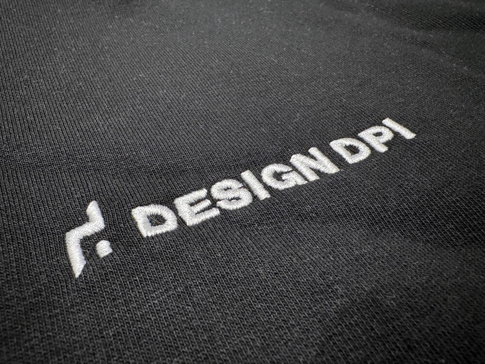
Typography matters just as much
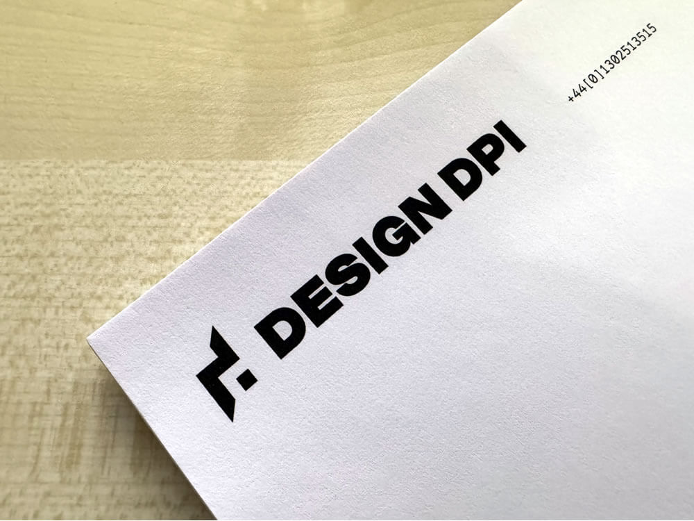
The brand mark is only half the story. The typography matters just as much.
That side of the identity has evolved too. Early on, the wordmark leaned into a more monospaced, lowercase sensibility. There was a time and a place for that, and it had charm. But over time, the typographic side of the logo became more refined and more considered.
The move to Range Mono kept some of that technical, system-aware character, but brought a lot more elegance and control with it. And the shift from lowercase to ALL CAPS was not arbitrary either. It improved legibility, increased confidence and made the wordmark feel more distinctive.
What I particularly like is the relationship between the symbol and the type.
The brand mark itself is angular, directional and quite architectural in character. The typography, by contrast, is chunkier, slightly softer and a little more rounded. That contrast is important. It creates balance.
If both parts were equally sharp and severe, the overall logo could risk feeling too hard-edged. By allowing the wordmark to be a little fuller and more accommodating, it complements the geometry of the symbol rather than competing with it. The two elements work together in a more symbiotic way.
There is a nice synergy there.
Even the lowercase d implied in the brand mark feels like a subtle nod back to the older lowercase typographic treatment, while the uppercase wordmark signals the confidence and maturity of the current identity. That combination feels right to me. A link to the past, but not a retreat into it.
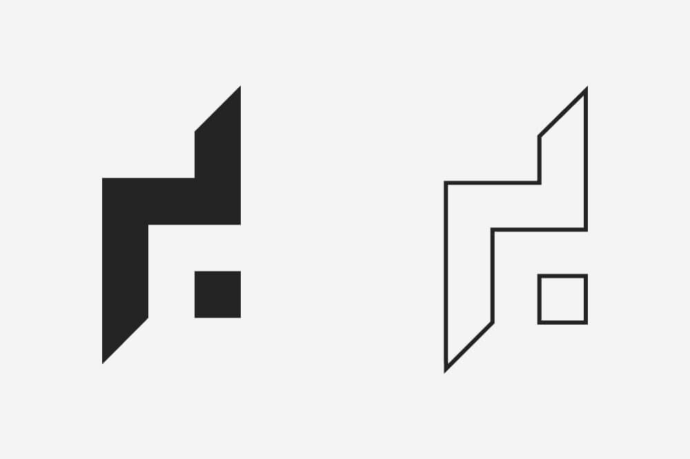
Solid, line, light and dark
A practical logo needs to perform in the real world.
That means it has to work on light backgrounds and dark backgrounds. In solid form and, where appropriate, as a line treatment. At large scale and small scale. On screen and in print.
The solid version of the DESIGN DPI brand mark is undoubtedly the strongest. It has more presence. More authority. More visual punch.
But because the underlying geometry is so clean, the mark also lends itself nicely to a line-based treatment. That opens up useful flexibility for digital applications, icons and supporting brand graphics.
That matters, because logos do not live in perfect conditions. They live in all sorts of places, and they need to hold together wherever they appear.
Why this matters to clients too
Although this article is about the DESIGN DPI logo, the thinking behind it is exactly the same thinking I bring to client branding work as well.
A good logo should not just be attractive. It should be appropriate, functional and distinctive. It should reflect the character of the business. It should scale well, reproduce well and feel coherent within a wider identity system. It should have enough simplicity to be memorable, and enough intent behind it to feel credible.
That is where a lot of logo design goes wrong. Too much trend. Too little structure. Too much novelty. Not enough longevity.
The goal is always to find that balance point where a logo feels both immediate and enduring.
For businesses looking at their own brand and wondering whether it still reflects who they are, that question is worth asking. Does the logo still fit? Does it still communicate the right things? Does it work properly across today’s applications? Does it feel built to last?
Those are the kinds of questions I enjoy helping clients answer.
Power in simplicity
At its core, the DESIGN DPI brand mark is built from very simple ingredients.
Basic shapes. Intentional spacing. Strong proportion. A modular grid. An implied lowercase d. A detached square doing more work than its size would suggest. A few carefully judged diagonals introducing direction and movement.
Simple, yes. But not simplistic.
That is where the strength is.
The best brand marks often have that quality about them. They feel clear enough to understand quickly, yet considered enough to reveal a little more over time. They do not need to shout. They just need to be right.
For me, that is what this mark achieves.
It is a letterform. A monogram. A nod to drafting and construction. A more mature expression of the business. A mark shaped by instinct, but disciplined by structure. A logo with roots in old-school process, but built to work in a modern world.
And perhaps most importantly, it feels like DESIGN DPI.

If you’d like to speak to us about how our multi-award-winning web design can guide your company through its digital journey, get in touch today, call 01302 513 515, email [email protected] or complete the form on the contact page.