Evolution of the design dpi Logo Design
I've been methodically going through some pretty ancient backups burnt to DVD, tracking down old web design projects, print design work, while generally gathering inspiration and content for future blog posts. Some of these backups date back to 1997, and before!
This backup that I found recently has a date of September 2004. Nothings really significant about the date as I have a healthy case of OCD when it comes to backing up. But what I found hidden away in a folder called /delete no less, was a relatively unassuming image file named original logo ideas.png
Here's a copy of the image, exactly as I found it.
original logo ideas.png 2001
It's safe to say the backup is from 2004, but this curious little file? It has to be from 2001, around the time design dpi came into being.
I'd love to know what else I was doing the time of this brain dump on to screen. I mean, the canvas size, 585 x 984 px is almost the size of A4 at 72dpi. Had I been working on some A4 print design for someone? If I was working on a print design at the time, could that explain the early use of the CMYK colour profiles for the logo, or was that the inspiration that I'd found on the inside of an empty taco shell packaging design?
This simple canvas raises more questions than anything else. But here it is, the very first musings for what would become my company, design dpi, all those years ago created in a tiny office, in a 2 bedroom flat in Worcester Park, Surrey.
So what do we have here, unlike the logo designs I work on these days, this looks like I was pretty focused with my thought process. There are only 20 fonts shortlisted here, unless I'd already agonized over 1,000's of other fonts (more than likely)?
Then there is the very retro tiny text "marketing, multimedia, print & web" ahhh, micro fonts. Those were the days, I don't think there was a website I designed between 2001 and 2005 that didn't have some uninteligable, tiny text somewhere on it.
But why was there some apparent urgency in this logo design? I mean, normally the design process for me is very labour intensive and lengthy preoccupation, with revisions after revisions. Why does this original concept look like it was hurriedly put together in one sitting? Very unlike me.
Vague recollections have me thinking, that it is 2001, I had been freelancing in London that summer, so does this fast tracked incorporation and new logo coincide with of some of the big pitches I had at the time?
There's also some kind of irony, surely, in that there are two grungy, almost graffiti like fonts used? The 2019 web design for design dpi, champions a grungy graffiti wall, pride of place on the homepage, coupled with hidden graffiti writing with the words design dpi. Sorry, but I just find that a little bit spooky!
I'd had the 2005 version of the logo for so long, I'd completely forgotten about the very first logo design which I must of had for the first 4 years.
design dpi logo design 2001
I really did stick with the CMYK inspiration a little too literally didn't I? Then again, at the time and on the website I had, it really did work quite well. I think I must have just found drop shadows and glows around this time as the outer glow on the text seems a little bit too much. Maybe if I find that old web design it will help put this old logo design into context.
But, is that a mistake in the design I notice? Surely the colours should follow the CMYK pattern? Yet in the logo, it follows a CYMK pattern! I'm sure I'm a little dyslexic, that's my excuse. It must be by design, it must be, how else could I have missed and lived with such an oversight all these years, haha!
I do know for a fact, that the logo was revised in the summer of 2005. A couple of reasons spring to mind, well, of course I have backups, but it was my 30th birthday that summer, we'd just recently moved back to Yorkshire and in some respects, it felt like I was starting design dpi up all over again having moved back home to God's own country, Yorkshire.
It was also around this time that I set up a new web design for the company, a complete fresh start if you will, and for the very first time I ordered my business stationary, business cards, compliment slips, letterheaded paper. So it was a perfect time for a logo design revamp, improving I guess on the original logo design and setting the designs up at 300dpi for print.
design dpi logo design 2005
The 2005 logo obviously has a more muted CMYK colour palette, certainly more subtle colour variations, a more toned down, corporate colour palette if you will. But I'm still a little curious as to why the text got fat? Don't get me wrong, I still think it looks great after all these years, just a little chunky.
However, after 17 years and with a website that hadn't been updated in 6, the time was right for a rebrand. So I set about designing a completely new logo, and this time, I agonized over the new design for months and months.
Truth be told, I wanted something that my little 5 year old girl could relate to. I'm in my office far too often, and as much as I needed the rebrand commercially, I wanted something that she would find fun and approachable.
design dpi logo design 2018
What I find fascinating is that the logo has gone full circle, in that, what was originally a 'regular' font weight, got bloated between 2005 to 2018 (much like my waistline), only to go back to being slim again. Just not as slim as the early 00's… sigh.
So many little intricate amends were made, for example, the diacritic dots above the 'i's, were made to be more symmetrical, square. The 'p' is actually an inverted 'd' with a few other modifications. I basically played around with most of the paths on the lettering, the kerning, I manually adjusted to the point of madness.
But there were SO MANY other logo designs before I finally accepted the final design you can see above.
Here's just a few of them.
design dpi logo concept 2018
Not too dissimilar to the old design, it's kind of a subtle nod to the old logo, while at the same time being brand new. It was just one of the many concepts I played around with.
design dpi logo concept 2018
Again, it's kind of a play on the original logo design, that was the intention at least. Nice to see the font getting progressively thinner with these designs.
design dpi logo concept 2018
I still like this design very much, but again, it probably speaks more about print design than web design. It's the first use of the new colour scheme including green and purple that I'd come to use throughout the entire rebrand. Plus, it's a completely different typeface. I don't know, I might have to revisit this one at some point?
The one thing that still strikes me though with most of these logo designs, is that they all convey more of a print design role for the business rather than web design. When you consider print design probably makes up about 5% of what I do, I think that's why the new logo in all of it's variations can be applied to both the web and print successfully.
At least that is the intention with the new logo, to facilitate more of a creative design logo suitable for a full service creative agency.
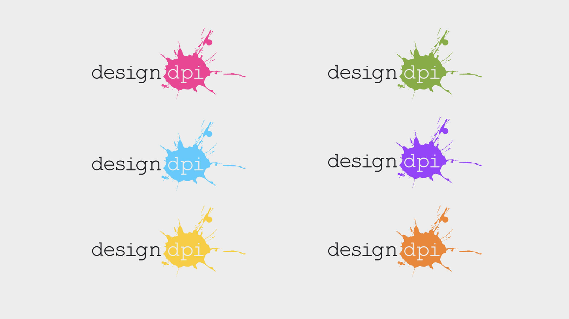
design dpi logo variation light background
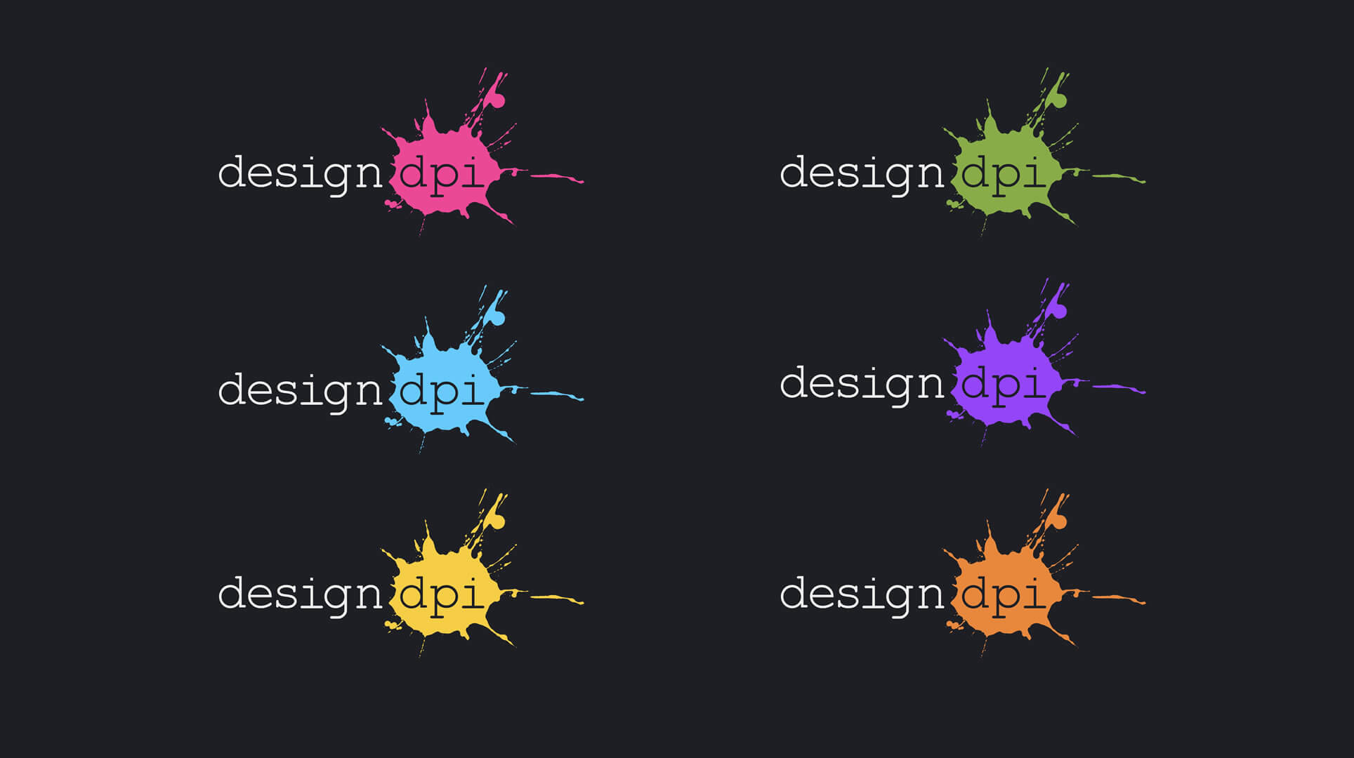
design dpi logo variation dark background
All this being said, and here I am sat writing this in 2019 on my dual screen set up, with Photoshop open on the other screen, contemplating modifying the logo design yet again!?
Forever tweaking,

If you’d like to speak to us about how our multi-award-winning web design can guide your company through its digital journey, get in touch today, call 01302 513 515, email [email protected] or complete the form on the contact page.