Patchsave Solutions Logo Design Over the Years

I'm really enjoying spending a bit of time every now and again going through old backup discs. I've recently written about the Evolution of the design dpi logo design, so thought it would be quite interesting to take a look at some of my other logo design transformations over the years.

This kind of logo design work totally fascinates me. I've been fortunate enough to work with and witness other companies evolve over the years, being part of that process is something I don't ever take for granted. Each design in many respects is a snapshot of not just where I was personally as a designer at the time, but also an indication of design styles that have ultimately shaped our visual communication over the years.

Boy oh boy, how times have changed, and hey, it's not everytime we get it right first time.

Patchsave Solutions Logo Design 2015 - present
Patchsave Solutions Logo Design 2015 to present
The Patchsave Solutions typeface is a fixed-pitch, monospaced font, ideal for a companies logo design in the IT sector.

Just how did this present day logo design come in to being? Let's take a look at some of the logo concept designs over the past 15 years.

Logo Design Concept (First Batch), 2004
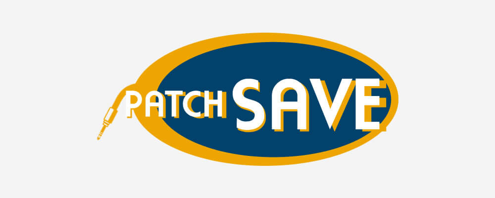
Logo Design Concept 2004 (First Batch)
The VERY first logo design concept, I was certainly channeling that wholesale save zeitgeist, and I'll be honest, I don't think at the time I was even sure what a patch cable was... evidently 🤦‍♂️

Logo Design Concept (First Batch), 2004
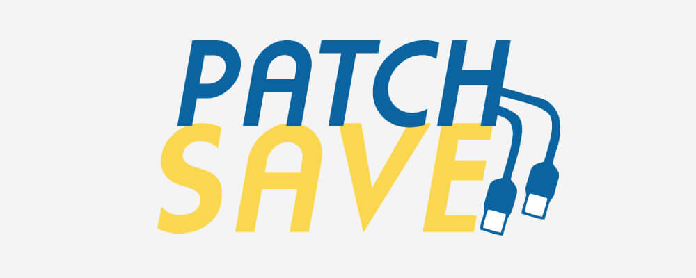
Logo Design Concept 2004 (First Batch)
OK, the plugs shape is a bit better, but more USB than RJ45 Cat5e.

Logo Design Concept (First Batch), 2004
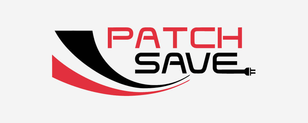
Logo Design Concept 2004 (First Batch)
These logo designs sure do scream early naughties, sweeping graphics, bold colours, but what's that connector, a 2 pin EU power plug!?

Logo Design Concept (First Batch), 2004
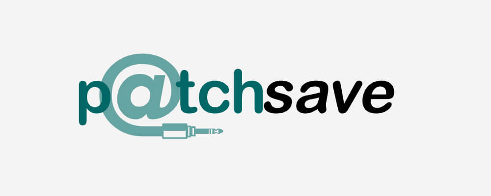
Logo Design Concept 2004 (First Batch)
What the heck is this, back in the day it was all about the 'at symbol' and here we go again with a 3.5mm audio jack plug.

Logo Design Concept (First Batch), 2004
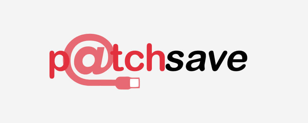
Logo Design Concept 2004 (First Batch)
Variation on a theme, back to the USB rather than 3.5mm audio jack. What was I smoking?

Fifteen years later, I can genuinely remember a feeling of disappointment from the client after presenting these. It was quite early in my career, particularly for logo design, and I learnt a really valuable lesson about the design process. That was to educate myself about as many aspects of the clients business as best as I could. Being politely told what a Cat5e connection should look like, still drives me to this day.

Needless to say, and quite rightly, it was back to the drawing board, or in this case back to a blank canvas in Macromedia Fireworks. Yep, Fireworks, let's not forget I was and am a web designer first, and I loved me some Macromedia Fireworks, still do *sigh*, yeh, I've still got a copy of Adobe Fireworks CS6 on my machine, don't judge.

Be warned though, there may be an ever so slight abuse of the drop shadow on the rest of the page. Safe to say, I overused the drop shadow for a hot minute in the early naughties.

Logo Design Concept (Second Batch), 2004
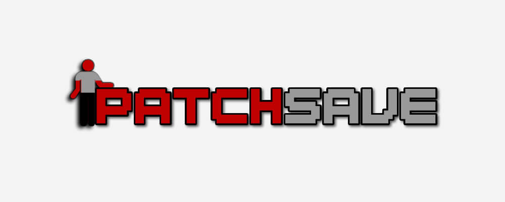
Logo Design Concept 2004 (Second Batch)
I always kind of liked this funky, almost retro (retro even for 2004) logo design. It was all about the service, and little road sign men where cropping up in designs everywhere at the time, just me?

Logo Design Concept (Second Batch), 2004
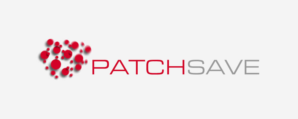
Logo Design Concept 2004 (Second Batch)
Now we're talking, clean, crisp, perhaps even modern design for 2004. The plan was to animate the logos blurred dots and use them as an intro, a splash page perhaps, using Macromedia Flash to compliment the overall website design.

Logo Design Concept (Second Batch), 2004

Patchsave Solutions Logo Design Concept 2004
I keep coming back to this geometric pattern in my logo designs over the years, that was until I realised much later in life that it is virtually identical to the Ivan Chermayeff designed Chase Manhattan Bank Logo. There's only so many geometric shapes though, am I right?

Logo Design Concept (Second Batch), 2004
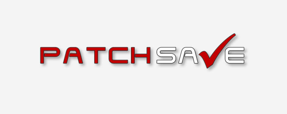
Patchsave Solutions Logo Design Concept 2004
Oooh, this is tantalising... the first usage of the Patchsave 'tick' back on point with the wholesale saving theme, but we might be on to something here.

Logo Design Concept (Second Batch), 2004

Patchsave Solutions Logo Design Concept 2004
An interesting play on the previous logo design, if not a little curious though as to why I didn't include the tick in place of the V?

I'm pretty sure at this stage after the second batch of concepts, the client hinted that the 'tick' might be the way forward, and that's why I went off on a tangent, to present the client a complete set of different ideas and logo design concepts, incorporating the tick along the way.

Logo Design Concept (Third Batch), 2004

Patchsave Solutions Logo Design Concept 2004
First use of the lozenge logo design, coupled with the Patchsave tick. Was it total serendipity though that this font would 4 years later become the main typeface, used in the logo design between 2009 and 2012?

Logo Design Concept (Third Batch), 2004
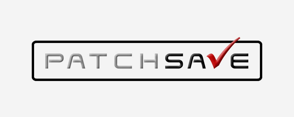
Patchsave Solutions Logo Design Concept 2004
Oooh, this is nice, we've tweaked things and added a bevel to the text and tick, who knew at the time that this baby would be the final logo design, bevel and all.

Logo Design Concept (Third Batch), 2004

Patchsave Solutions Logo Design Concept 2004
I'm kind of really liking this one. So much so, I'm actually designing some logos for a new client at the moment, so don't be surprised if this typography gets another run out.

Logo Design Concept (Third Batch), 2004
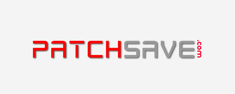
Patchsave Solutions Logo Design Concept 2004
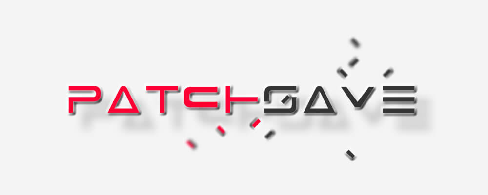
Not bad, is probably the best I can do to describe this. I'm not sure what I was thinking with the .com positioned so awkwardly.

Logo Design Concept (Third Batch), 2004
Patchsave Solutions Logo Design Concept 2004
Again, I was kind of thinking outside the box on this one, imagining how this logo would look animated as an opening intro to the website. This still looks pretty cool today, well, I think so anyway. I can still see in my minds eye how this Macromedia Flash animation would have played out.

Logo Design Concept (Third Batch), 2004
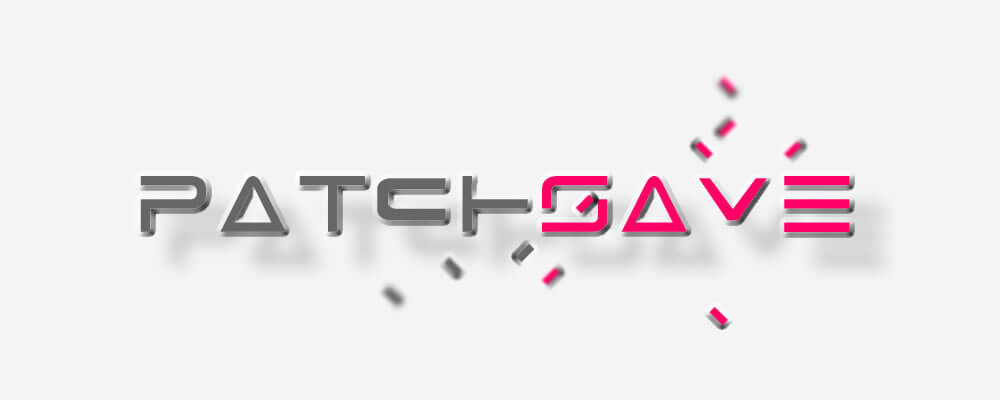
Patchsave Solutions Logo Design Concept 2004
Yup, still think this looks pretty sweet, and the colours!? I might just have to throw this design into Adobe Animate, or more likely After Effects, to see what this would look like animated.

Logo Design Concept (Third Batch), 2004
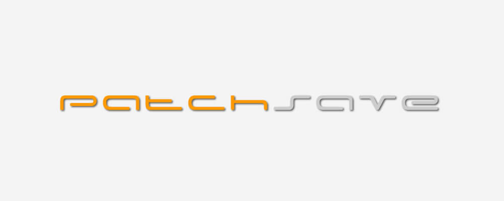
Patchsave Solutions Logo Design Concept 2004
As with many of the logo designs in the third batch, the client had already suggested the lozenge and tick where the way to go. I just wanted to throw a curve ball at the logo design, just to add a bit of variety into the mix.

Logo Design Concept (Third Batch), 2004
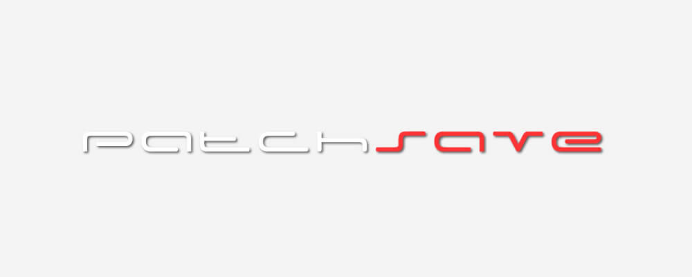
Patchsave Solutions Logo Design Concept 2004
Variation on the previous logo design, back on brand with the colour scheme though.

Logo Design Concept (Third Batch), 2004

Patchsave Solutions Logo Design Concept 2004
Can you get any more turn of the century geometrically corporate than this? Yes, distorted hexagons, so very original, sheesh.

Logo Design Concept (Third Batch), 2004
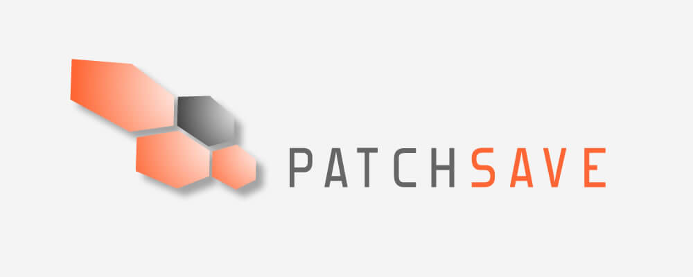
Patchsave Solutions Logo Design Concept 2004
Variation on a theme with a different typeface, not sure why I kept trying to inject other colour palettes into the design, particularly oranges and yellows? I'm pretty sure we'd decided on the black, grey and red colour palette already?

Logo Design Concept (Third Batch), 2004
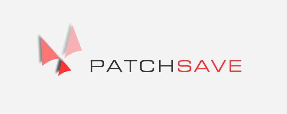
Patchsave Solutions Logo Design Concept 2004
Just when I thought the hexagons couldn't get any more original, why not have a trifecta of triangles in your logo design. Another one where I think I had visions of seeing the logo animated with Macromedia Flash, the triangles spinning onto the stage and easing into position.

Three iterations, and multiple logo designs that didn't even make the cut. The one thing I strive to achieve, even today, is making 100% sure the client is happy with their design. Whether that be logo design, print design or web design, I will go out of my way get on to the same page and understand my clients vision, doing everything I possibly can within my design arsenal to fulfill, meet and exceed their design expectations.

I certainly hope that was the case here. The final logo design would eventually end up being used, with subtle changes for 8 years between 2004 and 2012. But how this final logo design has evolved over the past 15 years, is equally fascinating as how it came into being in the first place.

Patchsave Logo Design 2004 - 2009

Patchsave Logo Design 2004 - 2009
The very first logo design for Patchsave which would launch the brand and be used across all of the companies marketing collateral in those formative years.

Patchsave Logo Design 2009 - 2012

Patchsave Logo Design 2009 - 2012
2009 saw an ever so subtle change, which probably tied in with the launch of a new website around the same time. The bevel was dropped to leave a nice, flat, clean looking logo design, with ever so slight tweaks to the colour palette.

Patchsave Logo Design 2012 - 2015

Patchsave Logo Design 2012 - 2015
It was all change in 2012. Remember that first logo design of the third batch from 2004, here's that typeface used for the rebrand in 2012. Again, this tied in with the launch of a new web design. Note the cosmetic changes to the eponymous Patchsave tick, and addition of the new logo tagline 'Conncting Your Network'.

Patchsave Solutions Logo Design 2015 - present

Patchsave Solutions Logo Design 2015 - present
The latest and current evolution of the logo design, incorporating the 'solutions' text and the new logo tagline 'The Data Centre Difference'. Keeping on brand with the Patchsave tick encased within a classic rounded square.

Little do we realise we're looking at dozens of rounded square logos every day on our handheld devices. The current logo with it's rounded square, is very much a modern design which can be perceived as being popular with tech companies. The angular geometry of the square can symbolise professionalism, stability, dependability. Adding the Patchsave Solutions tick to the rounded square made perfect sense with the company being in the IT industry, and it's future use as an App icon.

The colour palette hasn't really changed that much over the years. Black, grey and red have always been the corporate colours, with the colour palette you can see below being those chosen as the latest brand guidelines.

  • Nero

    HEX: #201F1F

  • Grey Suit

    HEX: #929297

  • Cinnabar

    HEX: #EE3224

I hope you've found this nostalgic logo transformation as interesting as it was for me to review. I genuinely can't wait to see what other designs I uncover in these old archive backups.

Perhaps another post could look at the evolution of the Patchsave Solutions website over the last 15 years?

Thanks for looking, and I'd love a comment or two, a comment that wasn't from a spam bot would be nice 😂

David Ellicott's squiggle