Flexible Exercise Logo Design
July 2019 sees the long overdue relaunch of the design dpi website after the six year hiatus. With that in mind, I've also been coming up with ideas for future blog posts.
Considering the old site hadn't been updated in six years, I thought, what better way to showcase some of the work that never gets to see the light of day? Or work that has long since been forgotten about. Let's not forget I've been doing this 22 years.
In this example I'm going to showcase some logo designs which have only ever been shown to Caroline and her husband Lee at Flexible Exercise.
With any new client, especially one without a brand identity already. The design and concept stage is a critical moment in the timeline of the project, as the logo design will have such a big impact on the rest of the design process.
This is why I take the whole 'design to deliver' ethos so seriously, presenting several variations of logo design concepts, to cherry pick with the client face-to-face, then naturally evolving the logo over time.
Here are some of the logo design concepts presented to Caroline, back in 2016.
Which logo design would you have chosen?
Logo Design 01.
Logo Design 02.
Logo Design 03.
Logo Design 04.
Logo Design 05.
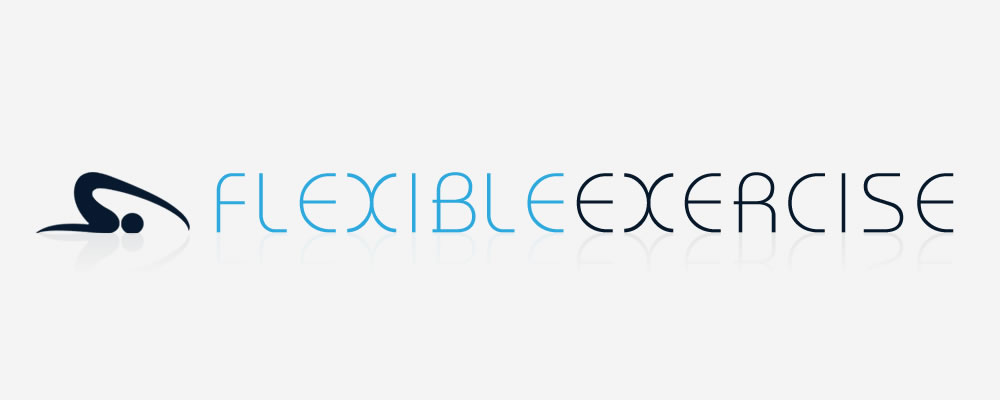
Logo Design 06.
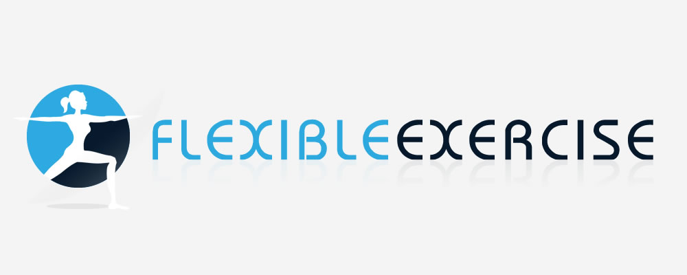
Logo Design 07.

Logo Design 08.
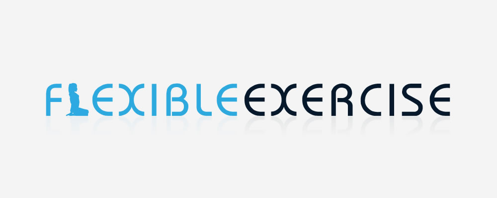
Logo Design 09.
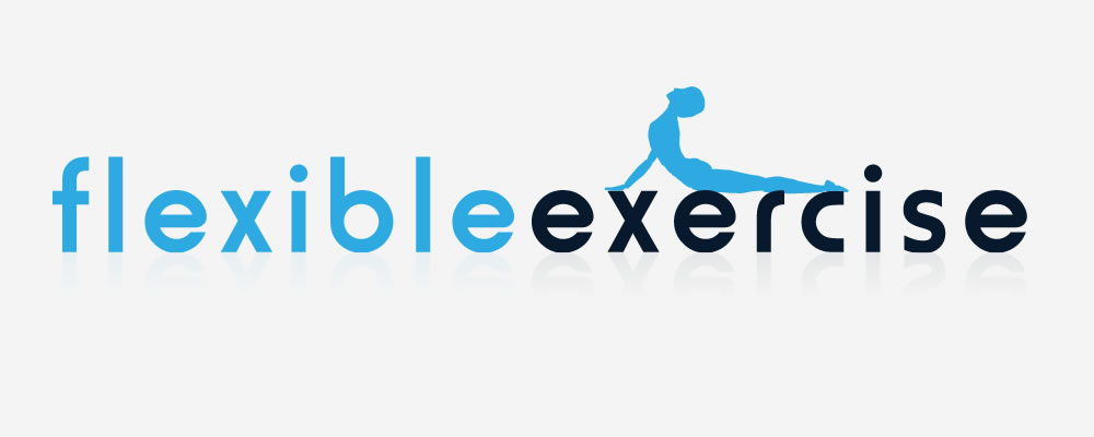
There you have it, all the initial logo design concepts first presented to Caroline and Lee.
What's really interesting, and perhaps this is just the inner geek in me speaking, but while looking through old backups for these original logo designs, in one of the layers in the Illustrator file, I just happened to spot this tiny little colour palette… the original colour scheme we matched against a running jacket Caroline was wearing the day of our first meeting.
-
Black Pearl
HEX: #06192E
-
Astronaut
HEX: #3C5179
-
Summer Sky
HEX: #2CAADF
-
Fruit Salad
HEX: #4DAD46
-
Heliotrope
HEX: #DC73FF
Pretty neat, huh?
If you'd like to see how the final logo and brand came together, you can view the full Flexible Exercise case study in our portfolio.

If you’d like to speak to us about how our multi-award-winning web design can guide your company through its digital journey, get in touch today, call 01302 513 515, email [email protected] or complete the form on the contact page.

