Spot the Difference
While I was coming up with ideas related to the new web design for design dpi, I had, for quite some time had an idea of a wall of graffiti. Something that would compliment the new paint splatter logo design.
Considering this image was going to be featured prominently on the homepage of the new site, for a few weeks after launch at least, I really wanted an image that worked well with the website concept I had in my minds eye.
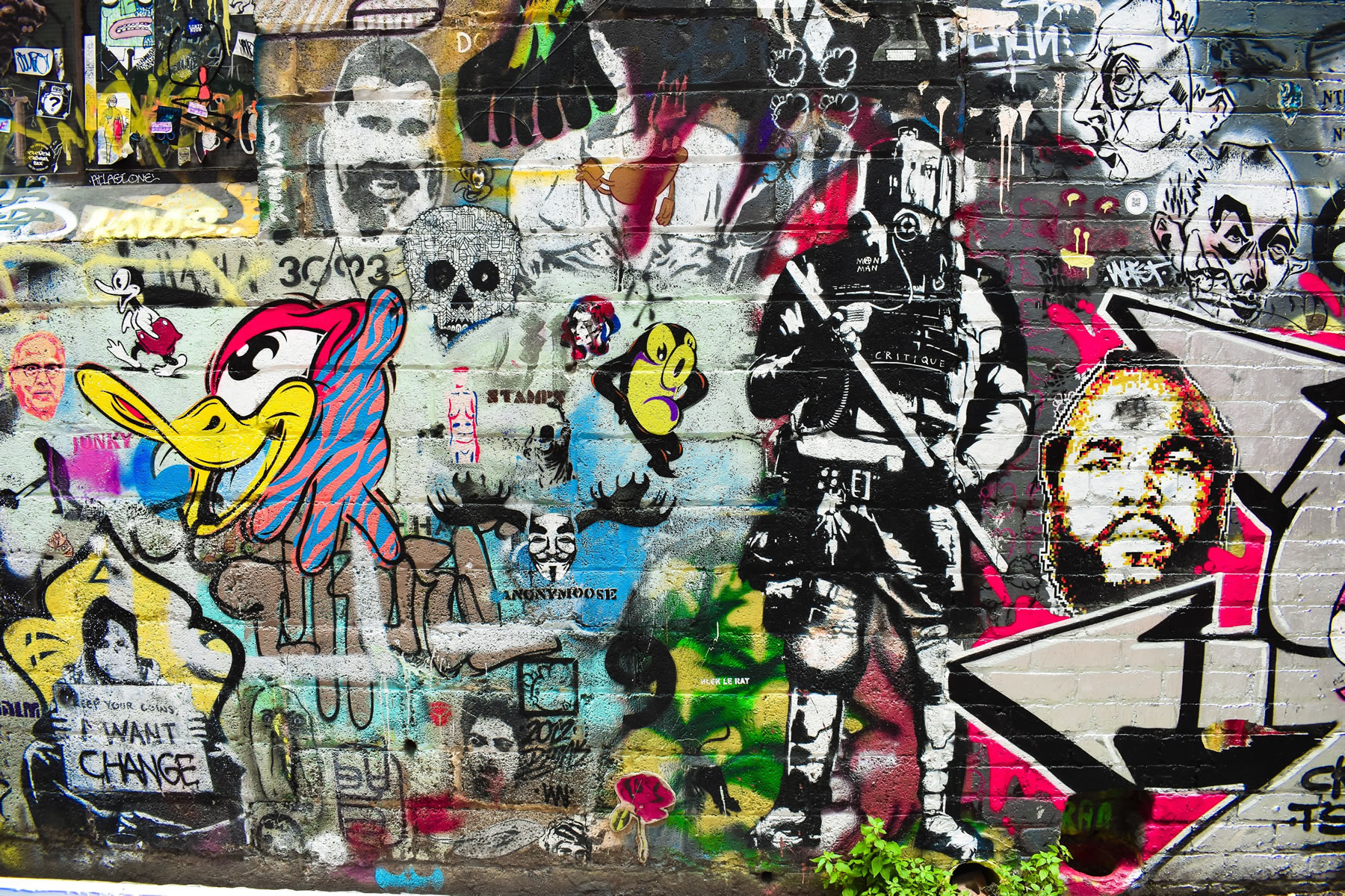
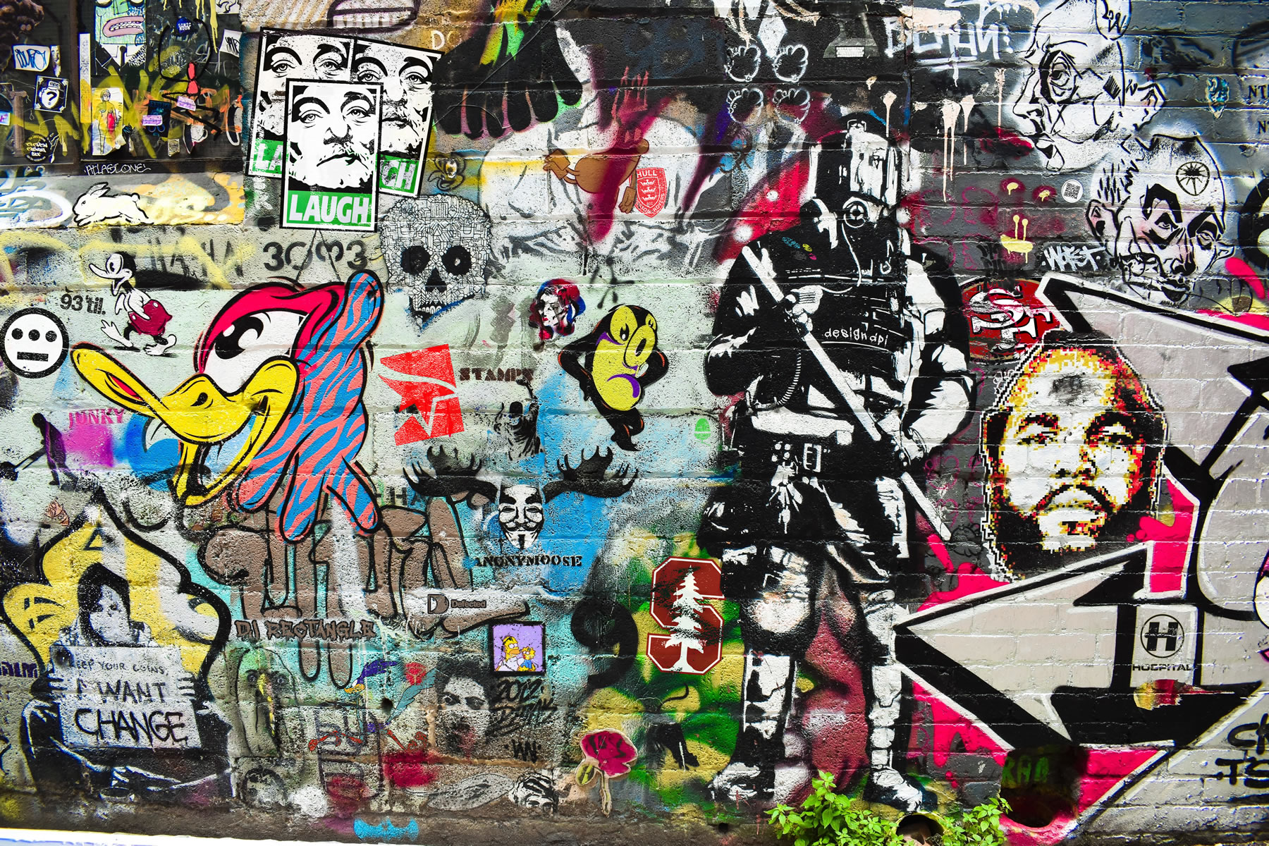
I looked around the usual sources for inspiration and when I found this image photographed by Jase Hess in Melbourne, I just knew this would work with what I had in mind, not just for the overall aesthetic of the new web design of the homepage, but also the concept to Photoshop in some elements that are personal to me.
For the casual visitor to the website, I doubt if anyone would even notice these additions, especially with some of the Photoshop techniques used to incorporate these curiosities in to the original wall of graffiti, I obviously wanted these new elements to look like they belonged there. That was the plan at least.
The idea then came a little later to create this blog post, adding not just the before and after Photoshop images, but I also wanted to add the image comparison slider you can see below, as I really wanted to get one of these working on the new website so that I may use it elsewhere for comparing some of the website redesign projects, as web design for particularly bad, under performing sites is such a big part of what I do.
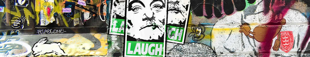
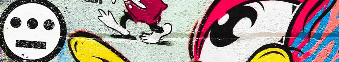
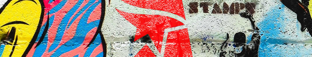
Take a look here at the before and after images and see if you can spot the 15 differences. Struggling to find all 15, then maybe the following image comparison slider will help.
Image Comparison Slider


List of the differences
1. San Francisco 49ers logo
I've been a huge fan since 1981 (thanks Mum), and have been lucky enough to visit both Candlestick Park and Levis Stadium on several occasions. I'm also one of the admins of The Official San Francisco 49ers Supporters Club 49ers Faithful UK.
2. Hull Kingston Rovers logo
I've been a Robin for as long as I can remember (thanks Grandad), although I don't get to games nearly as often as I'd like, besides, I've classed myself a bit of a Jonah if I visit Craven Park these days #TrueStory.
3. South Sydney Rabbitohs logo
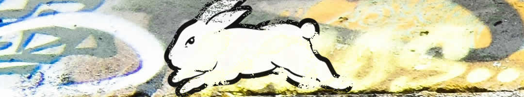
I've supported the bunnies since my first trip to Australia in 2004 and got to see them play live in 2015 at the World Club Challenge in St Helens.
4. Stanford Cardinal logo
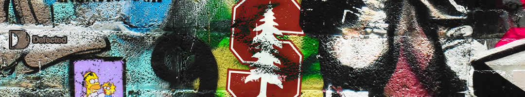
My love for US sports, particularly American football extends to the Stanford Cardinal. I've seen them play, and beat, Notre Dame twice. Being at a college game, well, there is no other experience quite like it.
5. Road Runner
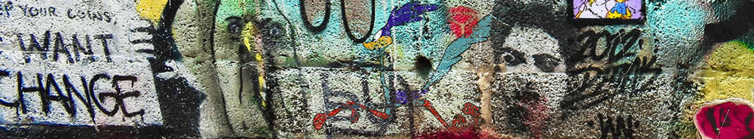
I got the Road Runner tattoo on my nineteenth birthday, pretty ironic considering my favourite past time now I'm in my forties is running. But truth be told, I'll take trail running over road running every day.
6. Acorn Electron logo
A little dedication to the machine that I first learnt the BASICs (geddit) of code on (thanks Dad), who knew all those single line IF statements would come in handy one day.
7. Bill Murray Laugh poster
8. Souls of Mischief / Hieroglyphics logo
I love hip-hop in many flavours, but when I heard Oakland's finest in the early '90s… well, they still blow me away today. Lyrically and musically second to none.
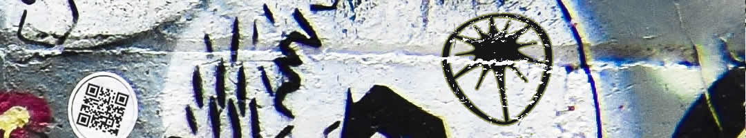
9. Mirrors Edge logo
10. Homer and Maggie Simpson
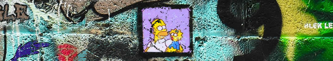
Just a little reminder of why I do what I do, taken from The Simpson's episode "And Maggie Makes Three", if you've ever wondered what the binary message is in my email footer:
01000100 01001111 00100000 01001001 01010100 00100000 01000110 01001111 01010010 00100000 01001000 01000101 01010010 = Do It For Her.
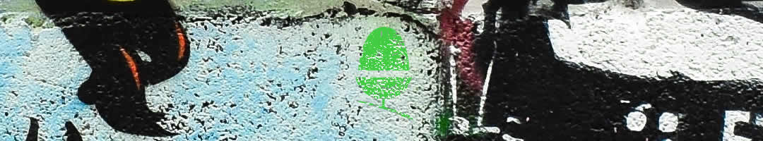
11. QR Code
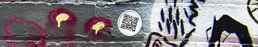
Interestingly there was a QR code in the original image, however, it wouldn't scan. So, I created this one for the design dpi website address.
12. Hed Kandi logo
13. Defected Records logo
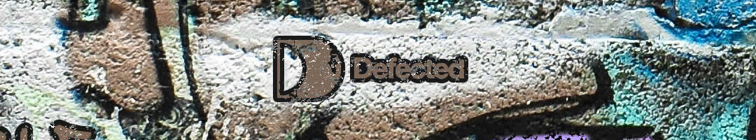
I have a pretty complete collection of nearly all Defected Records releases, Defected in the House, Defected presents, House Masters, Most Rated, For the Love of House. I am such a house music junky.
14. Hospital Records logo
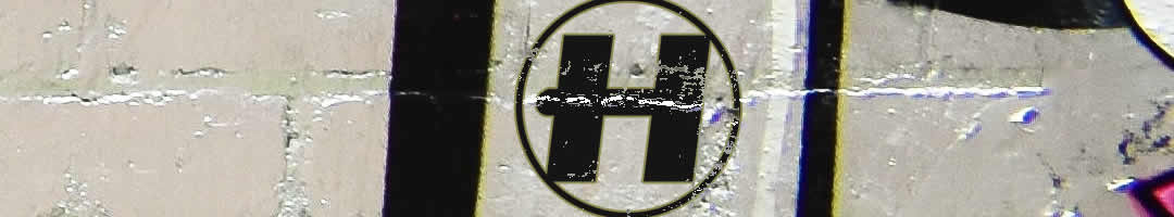
The finest independent label in Drum and Bass. There are of course other drum and bass labels, but there is only one Hospital Records, releasing some of the finest music that in my opinion is so highly, highly underrated.
15. DJ Rectangle
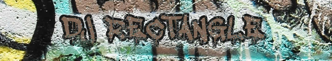
I got hold of my first DJ Rectangle mix tape back in 1999 and there is no substitute. Hands down the best turntablist on the ones and twos, I urge you to go check him out, his skills are otherworldly.
I hope you found this an interesting read? If anything, it gives you a little bit more of an insight into me, David the web design aficionado. What makes me tick, some of my interests and passions.
Please, feel free to drop me a message or leave me a comment if we have anything in common. Oh, and there is one more difference I didn't include in the list, so there's 16 in total. The last one is just a little ode to the old logo design, can you spot it?

If you’d like to speak to us about how our multi-award-winning web design can guide your company through its digital journey, get in touch today, call 01302 513 515, email [email protected] or complete the form on the contact page.